
Temporal preprocessing#
Preprocessing of (f)MRI data is quite a complex topic, involving techniques from signal processing (filtering), linear algebra/statistics (prewhitening, autocorrelation correction), and numerical optimization (image registration). Additionally, there is ongoing discussion about which preprocessing steps are necessary/sufficient and what preprocessing parameters are optimal. As always, this depends on your specific research question, the type and quality of your data, and the intended analysis.
In this week, we’ll discuss a couple (not all!) of preprocessing steps that are common in univariate fMRI analyses across two notebooks, one discussing temporal processing (the current notebook) and one discussing spatial preprocessing (the next notebook, spatial_preprocessing.ipynb).
What you’ll learn: after this lab, you’ll …
be able to explain the influence of preprocessing on the measured effects using the t-value formula
understand (the advantage of) temporal filtering from both the time-domain and frequency-domain
understand the necessity of prewhitening given the assumptions of the GLM
understand the advantage of spatial filtering (smoothing)
understand how to handle outliers
know how to implement the concepts above in Python
Estimated time needed to complete: 8-12 hours
Introduction#
As we said before, preprocessing is a topic that almost warrants its own course. Nonetheless, we’ll try to show you (and let you practice with) some of the most common and important preprocessing operations. Additionally, we’ll introduce the concept of the fast fourier transform, which allows us to analyze our signal in the frequency domain, which helps to understand several preprocessing steps, such as temporal filtering.
The t-value formula — yet again#
The previous two weeks, you have learned that, essentially, we want to find large effects (calculated as t-values) of our contrasts by optimizing various parts of the t-value formula. Conceptually, the t-value formula for a particular contrast (\(\mathbf{c}\)) can be written as:
Last week you’ve learned that by ensuring low design variance (through high predictor variance and low predictor correlations) leads to larger normalized effects (higher t-values). This week, we will discuss the other term of the denominator of this formula: the noise (also called the residual variance or unexplained variance), which is defined in the t-value formula as follows:
Through preprocessing, we aim to reduce the difference between our prediction (\(\hat{\mathbf{y}}\)) and our true signal (\(\mathbf{y}\)), thus reducing the noise-term of the formula and thereby optimizing our (“normalized”) effects.
On temporal vs. spatial preprocessing#
Roughly speaking, you can divide fMRI preprocessing into two types of operations: temporal and spatial. Temporal preprocessing involves operations that filter or otherwise affect the properties of your data across the time dimension (i.e., the time series). This is, of course, only applicable to functional MRI data (not structural or diffusion MRI). Examples of temporal operations are high-pass filtering and slice-time correction. Spatial preprocessing involves operations that filter or otherwise affect the spatial properties of your data (such as spatial orienatation, resolution, and shape). Examples of these spatial operations are spatial filtering (“smoothing”), distortion correction, motion correction (realignment), and spatial normalization/resampling.
In this lab, we’ll discuss these operations per theme: we’ll start with temporal operations and then move to spatial operations. Note that this is not the order in which data is usually preprocessed (see page 35 of the “Handbook of functional MRI Data Anslysis” textbook).
Let’s start with temporal preprocessing.
# First, some imports!
import numpy as np
from numpy.linalg import inv
from nilearn.glm.first_level.hemodynamic_models import glover_hrf
from scipy.interpolate import interp1d

import matplotlib.pyplot as plt
%matplotlib inline
Temporal preprocessing#
In this section, we will discuss how temporal preprocessing may greatly reduce the error term of our statistics. We’ll also delve into a variant of the GLM that deals with autocorrelation in our signals appropriately (“generalized least squares”, or GLS).
Slice-time correction#
Slice-time correction is a temporal resampling technique that corrects for the fact that, in (most) BOLD-MRI scan sequences, volumes are acquired slice by slice. This means that each slices is acquired at a slightly different time. For example, suppose that we are acquiring an fMRI run with a TR of 2 seconds and our volumes consist of 40 slices (acquired axially, inferior → superior). In this case, the acquisition of each slice takes \(\frac{TR}{N_{slice}} = \frac{2}{40} = 0.05\) seconds (let’s call this dt). This means that, for the very first volume, the “onset” of the first slice is at 0 seconds (and lasts until 0.05 seconds), while the onset of the last slice is at 1.95 (and lasts until 2.00 seconds). In code, we can calculate these slice onsets within a volume using the np.linspace(start, stop, n_steps) function:
TR = 2
n_slices = 40
slice_onsets_within_volume = np.linspace(0, TR, n_slices, endpoint=False)
# Note, this would have worked as well: np.arange(0, TR, TR / 40)

print("Length of slice onsets: %i" % slice_onsets_within_volume.size, end='\n\n')
print("Onsets of slices for first volume: %s" % (slice_onsets_within_volume,), end='\n\n')
print("Acquisition of first slice (of first volume) started at %.2f sec." % slice_onsets_within_volume[0])
print("Acquisition of last slice (of first volume) started at %.2f sec." % slice_onsets_within_volume[-1])
Length of slice onsets: 40

Onsets of slices for first volume: [0.   0.05 0.1  0.15 0.2  0.25 0.3  0.35 0.4  0.45 0.5  0.55 0.6  0.65
 0.7  0.75 0.8  0.85 0.9  0.95 1.   1.05 1.1  1.15 1.2  1.25 1.3  1.35
 1.4  1.45 1.5  1.55 1.6  1.65 1.7  1.75 1.8  1.85 1.9  1.95]

Acquisition of first slice (of first volume) started at 0.00 sec.
Acquisition of last slice (of first volume) started at 1.95 sec.
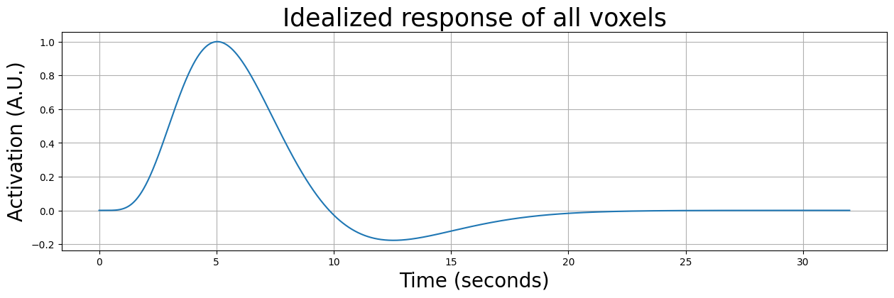
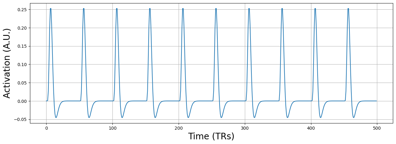
Now, let’s assume we do a very simple experiment, lasting 32 seconds (i.e., 16 volumes with a TR of 2), in which we show a single stimulus at \(t=0\). Furthermore, let’s assume that the entire brain responds to this stimulus with an idealized (noiseless response). In other words, the response of each voxel will look exactly like the HRF:
oversampling = 100
exp_length = 32
n_vols = 32 // TR

ideal_response = glover_hrf(tr=TR, time_length=exp_length, oversampling=TR * oversampling)
ideal_response /= ideal_response.max()
t = np.linspace(0, exp_length, ideal_response.size, endpoint=False)

plt.figure(figsize=(15, 4))
plt.plot(t, ideal_response)
plt.grid()
plt.title("Idealized response of all voxels", fontsize=25)
plt.xlabel("Time (seconds)", fontsize=20)
plt.ylabel("Activation (A.U.)", fontsize=20)
plt.show()
We must, however, take into accout that, even when our data would represent an idealized response, it would be sampled at different timepoints due to a difference in onsets for different slices. The first slice would for example be sampled at \([0, 2, 4, 6, ..., 30]\) seconds, while, for example, the middle slice would be sampled at \([1, 3, 5, ... 31]\) seconds. We can calculate the onset per slice across volumes using np.linspace again:
# Note: this is the onset of slice number "slice_num" **across volumes**
onsets_slice_across_volumes = np.linspace(dt * slice_num, length_exp + dt * slice_num, n_vols, endpoint=False)
where dt is the time it takes per slice (i.e., \(dt = \frac{TR}{N_{slice}}\)). So, to get the slice times for, e.g. slice number 23, for the experiment we have so far (i.e., with a TR of 2, 40 slices, and 32 second duration), we would compute the onsets as follows:
dt = TR / n_slices
slice_num = 23

# note the slice_num - 1, as Python uses 0-based indexing
start = dt * (slice_num - 1)
end = exp_length + dt * (slice_num - 1)
onsets_slice23_across_volumes = np.linspace(start, end, n_vols, endpoint=False)
print(onsets_slice23_across_volumes)
[ 1.1  3.1  5.1  7.1  9.1 11.1 13.1 15.1 17.1 19.1 21.1 23.1 25.1 27.1
 29.1 31.1]
So, even with a noiseless response, the data will look different per slice. We’ll plot this below for the first slice and the middle slice (on top of the idealized response):
onsets_s0_across_volumes = np.linspace(0, exp_length, n_vols, endpoint=False)
onsets_s20_across_volumes = np.linspace(dt * 19, exp_length + dt * 19, n_vols, endpoint=False)

print("Onset acquisition of slice 0 (first 10 volumes): %s" % (onsets_s0_across_volumes[:10],))
print("Onset acquisition of slice 20 (first 10 volumes): %s" % (onsets_s20_across_volumes[:10],))

# "Fit" the interpolation
resampler = interp1d(t, ideal_response)

plt.figure(figsize=(15, 4))
plt.plot(t, ideal_response)
plt.grid()
plt.title("Resampled slicewise responses", fontsize=25)
plt.xlabel("Time (seconds)", fontsize=20)
plt.ylabel("Activation (A.U.)", fontsize=20)

for onsets in [onsets_s0_across_volumes, onsets_s20_across_volumes]:
    # Do not use this code as an example to solve the next ToDo!
    # Because it does it the other way around.
    slice_sig = resampler(onsets)  # resample to slice times! kind of like inverse slice-time correction
    plt.plot(onsets, slice_sig, marker='*', ls='None', ms=10)

plt.legend(['Idealized response', 'Actual response slice 0', 'Actual response slice 20'],
           fontsize=15)
plt.show()
Onset acquisition of slice 0 (first 10 volumes): [ 0.  2.  4.  6.  8. 10. 12. 14. 16. 18.]
Onset acquisition of slice 20 (first 10 volumes): [ 0.95  2.95  4.95  6.95  8.95 10.95 12.95 14.95 16.95 18.95]
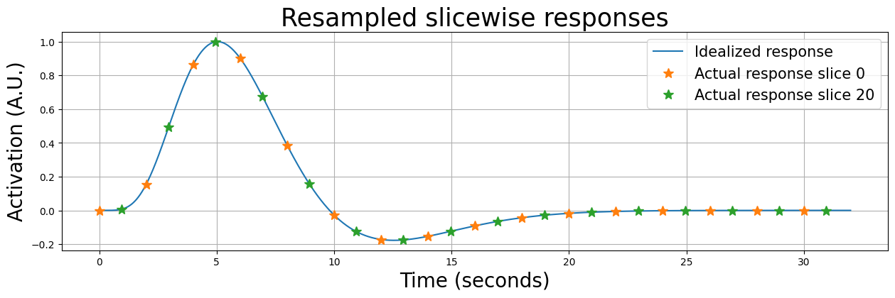
Now, if we would ignore the fact that these signals were acquired at different times (by assuming they were all acquired at \(t=0, t=2, t=4\) etc.), our model will be suboptimal for all slices (except for slice 0). We’ll show this below by plotting the resampled data from slice 0, 20, and 39 on top of the idealized response (which represents our predictor):
plt.figure(figsize=(15, 4))

slice_data = np.zeros((slice_sig.size, 3))
slice_onsets_across_volumes = np.zeros((slice_sig.size, 3))
for i, slc in enumerate([0, 19, 39]):
    t_slice = np.linspace(dt * slc, exp_length + dt * slc, n_vols, endpoint=False)
    slice_resp = resampler(t_slice)
    slice_data[:, i] = slice_resp  # save for later
    slice_onsets_across_volumes[:, i] = t_slice
    plt.subplot(1, 3, i+1)
    plt.plot(t, ideal_response)
    plt.plot(onsets_s0_across_volumes, slice_resp)
    plt.title("Slice %i" % (slc + 1), fontsize=25)
    plt.grid()

    if i == 0:
        plt.ylabel("Activation (A.U.)", fontsize=20)

    if i == 1:
        plt.xlabel("Time (seconds)", fontsize=20)
        plt.legend(['Model', 'Actual response'], fontsize=12)

plt.tight_layout()
plt.show()
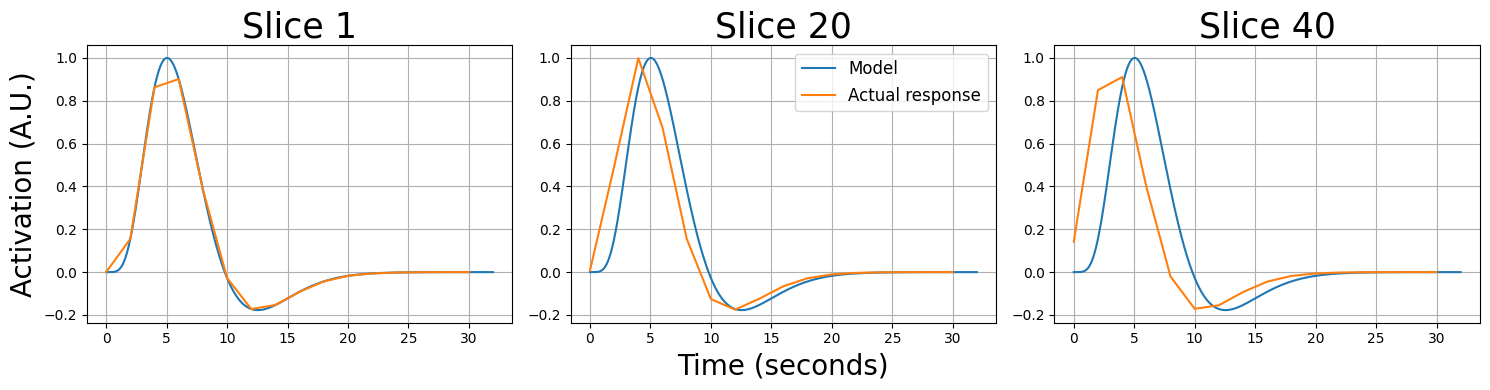
As you can see, “later” slices are quite misaligned relative to the idealized response/model (which assume that each slice is acquired at the start of the volume). We can fix this by resampling the data from different slices to the onset times of a reference slice. Basically, this amounts to saying: “what would the signal from slice x look like if it was acquired at the onsets of a reference slice”. This process is called slice-time correction.
Remember the temporal resampling of our “high precision” predictors that we did in week 2? We’re going to do something similar to our data, here. Basically, we are going to resample our slice-wise timesieres corresponding to a particular set of onsets (let’s call these the original_onsets) to the set of onsets of a particular reference slice (let’s call these the desired_onsets). Using the same interp1d function from week 2, we can do the following:
resampler = interp1d(original_onsets, original_signal)
std_signal = resampler(desired_onsets)
where original_onsets is a numpy array with onsets of each slice across volumes and the original_signal refers to the actual signal of that voxel (here: slice). They should be the same size. The desired_onsets is another numpy array with, in the case of slice-time correction, the same size as original_onsets.
Below, we’ll pick the first slice as the reference slice.
plt.figure(figsize=(15, 8))

plt.subplot(2, 1, 1)
for i in range(slice_data.shape[1]):
    plt.plot(onsets_s0_across_volumes, slice_data[:, i])
    plt.grid()
    plt.ylabel("Activation (A.U.)", fontsize=20)
    plt.title("Original slicewise responses", fontsize=25)

# Define reference slice as the first one (with onsets [0, 2, 4, 6, etc])
desired_onsets = onsets_s0_across_volumes

plt.subplot(2, 1, 2)
for i in range(slice_data.shape[1]):

    # Resample slice-specific onsets to desired onsets
    resampler = interp1d(slice_onsets_across_volumes[:, i], slice_data[:, i], fill_value='extrapolate')
    stc_slice = resampler(desired_onsets)

    # Plot relative to the reference onsets, i.e., onsets_s0 (first slice)
    plt.plot(onsets_s0_across_volumes, stc_slice)
    plt.grid()
    plt.title("Slice-time corrected data", fontsize=25)
    plt.xlabel("Time (seconds)", fontsize=20)
    plt.ylabel("Activation (A.U.)", fontsize=20)

plt.tight_layout()
plt.show()
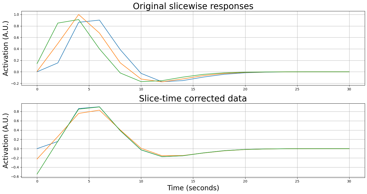
As you can see, the resampled time series resemble each other much more after slice-time correction! It’s showing some “edge artifacts” which are caused by extrapolation of the time series. In actual neuroimaging software packages, higher-order resampling (such as “cubic” or “spline” resampling) are used to somewhat mitigate this. Moreover, instead of the first slice, usually the middle slice is chosen as the reference slice, which reduces the amount of resampling (and extrapolation) that has to be done, further mitigating artifacts.
Note: this is a difficult ToDo!
Below, we load in new data (slice_data) from a very short experiment (60 seconds, TR = 3). The data are from 1 voxel from every of the 32 slices. Implement slice-time correction by resampling each slice to the onsets of the middle slice (slice no. 16). Use “cubic” interpolation (by setting kind=”cubic” when initializing your resampler). Please store the results in the pre-allocated array stc_data.
Tip 1: define the TR, number of volumes, length of experiment, and dt.
Tip 2: before looping over the different slices, define the onsets of the reference slice (remember: Python is 0-indexed).
Tip 3: you have to initialize your resampler again for every iteration of your loop!
Tip 4: when initializing your resampler, set fill_value=’extrapolate’.
Tip 5: plot your data before and after slice-time correction to see whether it worked properly (it should show you more-or-less aligned timeseries after STC, which may still show some differences in amplitude). Not part of the ToDo, but a good way to check your implementation.
Note: this is a ToDo which requires a little more code than usual!
slice_data = np.load('stc_data.npy')
print("Slice data is of shape (time x slices): %s" % (slice_data.shape,))

stc_data = np.zeros(slice_data.shape)

# YOUR CODE HERE
raise NotImplementedError()
""" Tests the above ToDo. """
from niedu.tests.nii.week_4 import test_stc_todo
test_stc_todo(slice_data, stc_data)
A short primer on the frequency domain and the Fourier transform#
Now, before we’ll delve into important temporal preprocessing operations, let’s discuss how we can represent time series in the frequency domain using the Fourier transform.
Thus far, we’ve always looked at our fMRI-signal as activity that varies across time. In other words, we’re always looking at the signal in the time domain. However, there is also a way to look at a signal in the frequency domain (also called ‘spectral domain’) through transforming the signal using the Fourier transform.
Basically, the fourier transform calculates to which degree sine waves of different frequencies are present in your signal. If a sine wave of a certain frequency (let’s say 2 hertz) is (relatively) strongly present in your signal, it will have a (relatively) high power in the frequency domain. Thus, looking at the frequency domain of a signal can tell you something about the frequencies of the (different) sources underlying your signal.
This may sound quite abstract, so let’s look at some examples.
# start with importing the python packages we'll need
from niedu.utils.nii import create_sine_wave
from numpy.linalg import inv
Sine waves are oscillating signals that have (for our purposes) two important characteristics: their frequency and their amplitude. Frequency reflects how fast a signal is oscillating (how many cycles it completes in a given time period) and the amplitude is the (absolute) height of the peaks and troughs of the signal. To illustrate this, we generate a couple of sine-waves (with a sampling rate of 500 Hz, i.e., 500 samples per second) with different amplitudes and frequencies, which we plot below:
max_time = 5
sampling_rate = 500
timepoints = np.arange(0, max_time, 1.0 / sampling_rate)

amplitudes = np.arange(1, 4)
frequencies = np.arange(1, 4)
sines = []

fig, axes = plt.subplots(3, 3, sharex=True, sharey=True, figsize=(13, 8))
for i, amp in enumerate(amplitudes):

    for ii, freq in enumerate(frequencies):
        this_ax = axes[i, ii]

        if ii == 0:
            this_ax.set_ylabel('Activity (A.U.)', fontsize=14)

        if i == 2:
            this_ax.set_xlabel('Time (seconds)', fontsize=14)

        sine = create_sine_wave(timepoints, frequency=freq, amplitude=amp)
        sines.append((sine, amp, freq))
        this_ax.plot(timepoints, sine)
        this_ax.set_xlim(0, 5)
        this_ax.set_title('Amp = %i, freq = %i' % (amp, freq), fontsize=18)
        this_ax.set_ylim(-3.5, 3.5)
        this_ax.grid()

fig.tight_layout()
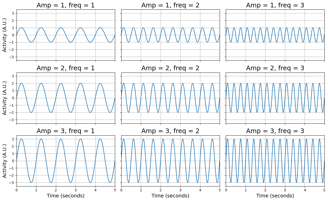
As you can see, the signals vary in their amplitude (from 1 to 3) and their frequency (from 1 - 3). Make sure you understand these characteristics! Now, we are going to use the fast fourier transform to plot the same signals in the frequency domain. We’re not going to use a function to compute the FFT-transformation, but we’re going to use a function that computes the “power spectrum density” directly (which makes life a little bit easier): the periodogram function from scipy.signal:
from scipy.signal import periodogram
Now, the periodogram function takes two arguments, the signal and the sampling frequency (the sampling rate in Hz with which you recorded the signal), and returns both the reconstructed frequencies and their associated power values. An example:
freqs, power = periodogram(some_signal, 1000) # sampling_rate = 1000 Hz
We’ll use the periodogram function to plot the 9 sine-waves (from the previous plot) again, but this time in the frequency domain:
fig, axes = plt.subplots(3, 3, sharex=True, sharey=True, figsize=(13, 8))

for i, ax in enumerate(axes.flatten()):
    sine, amp, freq = sines[i]
    title = 'Sine with amp = %i and freq = %i' % (amp, freq)
    freq, power = periodogram(sine, sampling_rate)
    ax.plot(freq, power)
    ax.set_xlim(0, 4)
    ax.set_xticks(np.arange(5))
    ax.set_ylim(0, 25)

    if i > 5:
        ax.set_xlabel('Frequency (Hz)', fontsize=15)

    if i % 3 == 0:
        ax.set_ylabel('Power', fontsize=15)

    ax.set_title(title, fontsize=15)
    ax.grid()

fig.tight_layout()
plt.show()
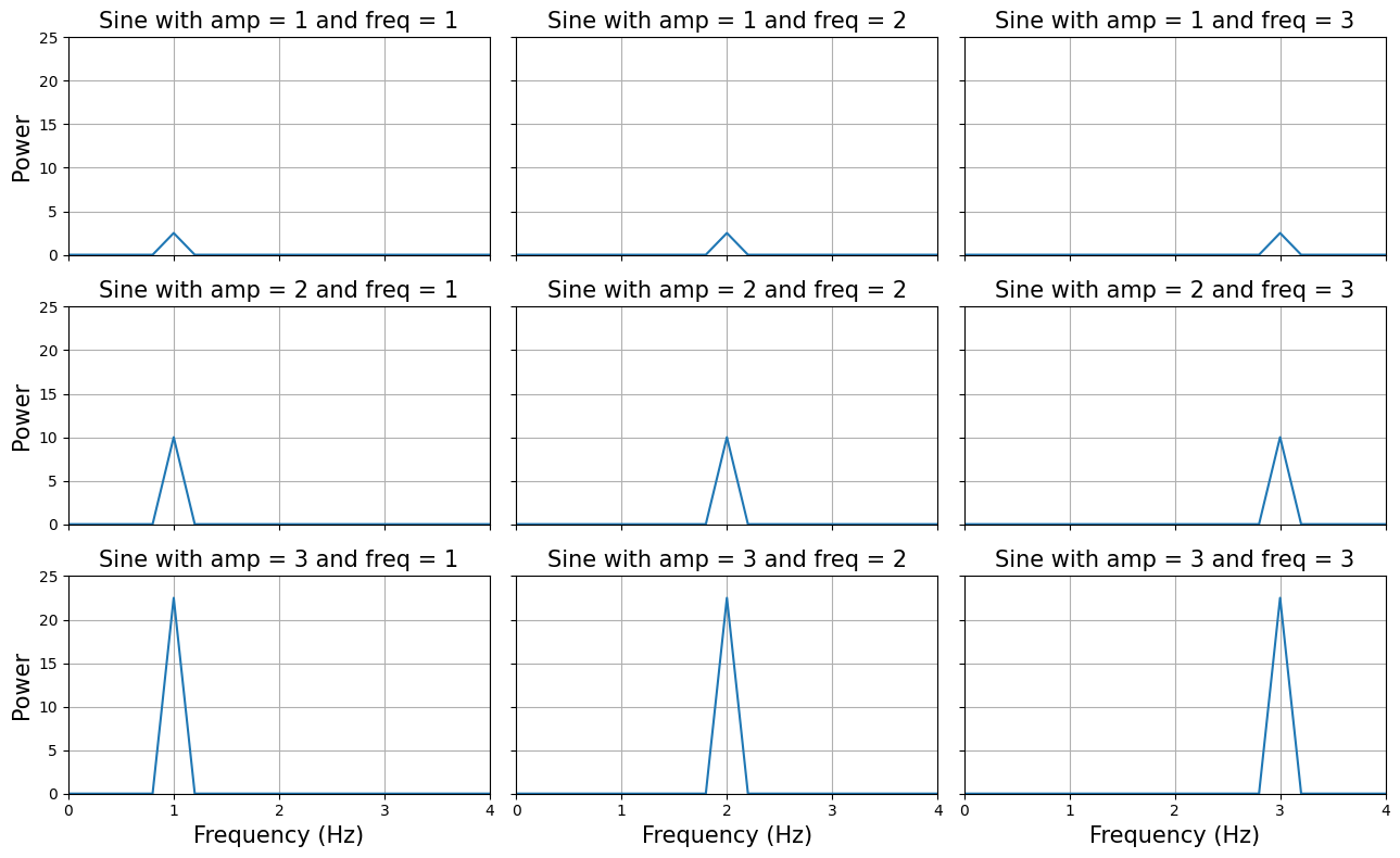
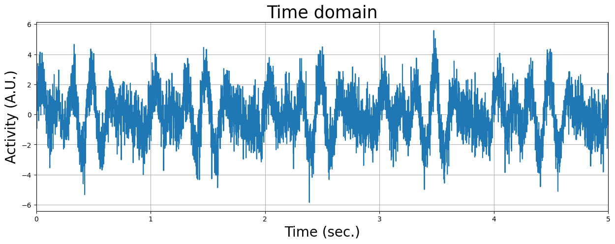
As you can see, the frequency domain correctly ‘identifies’ the amplitudes and frequencies from the signals. But the real ‘power’ from fourier transforms is that they can reconstruct a signal in multiple underlying oscillatory sources. Let’s see how that works. We’re going to load in a time-series recorded for 5 seconds of which we don’t know the underlying oscillatory sources. First, we’ll plot the signal in the time-domain:
mystery_signal = np.load('mystery_signal.npy')
plt.figure(figsize=(15, 5))
plt.plot(np.arange(0, 5, 0.001), mystery_signal)
plt.title('Time domain', fontsize=25)
plt.xlim(0, 5)
plt.xlabel('Time (sec.)', fontsize=20)
plt.ylabel('Activity (A.U.)', fontsize=20)
plt.grid()
plt.show()
# Implement your ToDo here

# YOUR CODE HERE
raise NotImplementedError()
Now you know that you can use visualization of the signal in the frequency domain to help you understand from which underlying frequencies your signal is built up. Unfortunately, real fMRI data is not so ‘clean’ as the simulated sine waves we have used here, but the frequency representation of the fMRI signal can still tell us a lot about the nature and contributions of different (noise- and signal-related) sources!
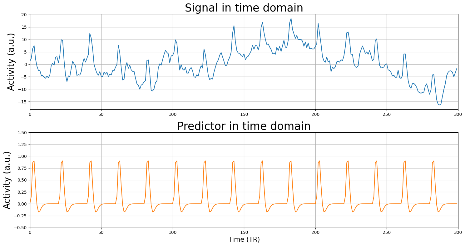
Frequency characteristics of fMRI data#
Now, we will load a (much noisier) voxel signal and the corresponding design-matrix (which has just one predictor apart from the intercept). The signal was measured with a TR of 2 seconds and contains 300 volumes (timepoints), so the duration was 600 seconds. The predictor reflects an experiment in which we showed 15 stimuli in intervals of 40 seconds (i.e., one stimulus every 40 seconds).
We’ll plot both the signal (\(y\)) and the design-matrix (\(X\); without intercept):
from niedu.utils.nii import simulate_signal

onsets = np.arange(0, 600, 40)
sig, X = simulate_signal(
    onsets,
    ['stim'] * onsets.size,
    duration=600,
    TR=2,
    icept=0,
    params_canon=[10],
    std_noise=5,
    rnd_seed=29,
    phi=0.95,
    plot=False
)
X = X[:, :-1]  # trim off the temporal derivative

print("Shape of X: %s" % (X.shape,))
print("Shape of y (sig): %s" % (sig.shape,))

plt.figure(figsize=(15, 8))
plt.subplot(2, 1, 1)
plt.plot(sig)
plt.xlim(0, sig.size)
plt.title('Signal in time domain', fontsize=25)
plt.ylabel('Activity (a.u.)', fontsize=20)
plt.grid()

plt.subplot(2, 1, 2)
plt.plot(np.arange(sig.size), X[:, 1], c='tab:orange')
plt.title('Predictor in time domain', fontsize=25)
plt.xlabel('Time (TR)', fontsize=15)
plt.xlim(0, sig.size)
plt.ylabel('Activity (a.u.)', fontsize=20)
plt.ylim(-0.5, 1.5)
plt.tight_layout()
plt.grid()
plt.show()
Shape of X: (300, 2)
Shape of y (sig): (300,)
Tip (feel free to ignore): This tutorial, you’ll be asked to compute t-values, R-squared, and MSE of several models quite some times. To make your life easier, you could (but certainly don’t have to!) write a function that runs, for example, linear regression and returns the R-squared, given a design (X) and signal (y). For example, this function could look like:
def compute_mse(X, y):
    # you implement the code here (run lstsq, calculate yhat, etc.)
    # ...
    # and finally, after you've computed the model's MSE, return it
    return r_squared
If you’re ambitious, you can even write a single function that calculates t-values, MSE, and R-squared. This could look something like this:
def compute_all_statistics(X, y, cvec):
    # Implement everything you want to know and return it
    # ...
    return t_value, MSE, r_squared # and whatever else you've computed!
Doing this will save you a lot of time and may prevent you from making unneccesary mistakes (like overwriting variables, typos, etc.). Lazy programmers are the best programmers!
(Note: writing these functions is optional!)
# Implement the linear regression part of the ToDo here:

# YOUR CODE HERE
raise NotImplementedError()
''' Tests the above linear regression ToDo. '''
from niedu.tests.nii.week_4 import test_mse_no_filtering
test_mse_no_filtering(X, sig, mse_no_filtering)
# Implement your y/yhat plot here (this is manually graded)

# YOUR CODE HERE
raise NotImplementedError()
YOUR ANSWER HERE
Two approaches to temporal preprocessing#
Basically, there are two ways to preprocess your data:
Manipulating the signal (\(\mathbf{y}\)) directly before fitting your GLM-model;
Including “noise predictors” in your design (\(\mathbf{X}\)) when fitting your model;
Often, preprocessing steps can be done both by method 1 (manipulating the signal directly) and by method 2 (including noise predictors). For example, one of the videos showed that you could apply a high-pass filter by applying a “gaussian weighted running line smoother” (the method FSL employs) directly on the signal (method 1) or you could add “low-frequency (drift) predictors” to the design matrix (method 2; in the video they used a ‘discrete cosine basis set’; the SPM method). In practice, both methods often yield very similar resuls. The most important thing to understand is that both methods are trying to accomplish the same goal: reduce the noise term of the model.
First, we will discuss how temporal and spatial filtering can directly filter the signal (method 1) to reduce error. Later in the tutorial, we will discuss including adding outlier-predictors and motion-predictors to the design to reduce noise (method 2).
High-pass filtering of fMRI data (option 1)#
From the previous ToDo, you probably noticed that the fit of the predictor to the model was not very good. The cause for this is the slow ‘drift’ — a low-frequency signal — that prevents the model from a good fit. Using a high-pass filter — meaning that you remove the low-frequency signals and thus pass only the high frequencies — can, for this reason, improve the model fit. But before we go on with actually high-pass filtering the signal, let’s take a look at the frequency domain representation of our voxel signal:
plt.figure(figsize=(17, 5))
TR = 2
sampling_frequency = 1 / TR  # our sampling rate is 0.5, because our TR is 2 sec!
freq, power = periodogram(sig, fs=0.5)
plt.plot(freq, power)
plt.xlim(0, freq.max())
plt.xlabel('Frequency (Hz)', fontsize=15)
plt.ylabel('Power (dB)', fontsize=15)
plt.axvline(x=0.01,color='r',ls='dashed', lw=2)

plt.show()
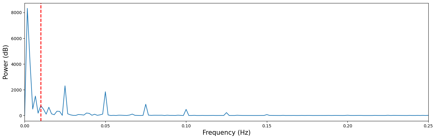
In the frequency-domain plot above, you can clearly see a low-frequency drift component at frequencies approximately below 0.01 Hz (i.e., left of the dashed red line).
YOUR ANSWER HERE
Now, let’s get rid of that pesky low frequency drift that messes up our model! There is no guideline on how to choose the cutoff of your high-pass filter, but most recommend to use a cutoff of around 100 seconds (i.e., of 0.01 Hz). This means that any oscillation slower than 100 seconds (one cycle in 100 seconds) is removed from your signal.
Anyway, as you’ve seen in the videos, there are many different ways to high-pass your signal (e.g., frequency-based filtering methods vs. time-based filtering methods). Here, we demonstrate a time-based ‘gaussian running line smoother’, which is used in FSL. As you’ve seen in the videos, this high-pass filter is estimated by convolving a gaussian “kernel” with the signal (taking the element-wise product and summing the values) across time, which is schematically visualized in the image below:
One implementation of this filter is included in the scipy “ndimage” subpackage. Let’s import it*:
*Note: if you’re going to restart your kernel during the lab for whatever reason, make sure to re-import this package to avoid NameErrors (i.e., the error that you get when you call a function that isn’t imported).
from scipy.ndimage import gaussian_filter
The gaussian_filter function takes two mandatory input: some kind of (n-dimensional) signal and a cutoff, “sigma”, that refers to the width of the gaussian filter in standard deviations. “What? We decided to define our cutoff in seconds (or, equivalently, Hz), right?”, you might think. For some reason neuroimaging packages seem to define cutoff for their temporal filters in seconds while more ‘low-level’ filter implementations (such as in scipy) define cutoffs (of gaussian filters) in the width of the gaussial filter, i.e., sigma. Fortunately, there is an easy way to convert a cutoff in seconds to a cutoff in sigma, given a particular TR (in seconds):
where \(\ln{2}\) refers to the natural logarithm (i.e., log with base \(e\)).
# Implement your ToDo here

# YOUR CODE HERE
raise NotImplementedError()
''' Tests the above ToDo.'''
from niedu.tests.nii.week_4 import test_sec2sigma
test_sec2sigma(sec=80, ans=sigma_todo)
Importantly, the gaussian filter does not return the filtered signal itself, but the estimated low-frequency component of the data. As such, to filter the signal, we have to subtract this low-frequency component from the original signal to get the filtered signal!
Below, we estimate the low-frequency component using the high-pass filter first and plot it together with the original signal, which shows that it accurately captures the low-frequency drift (upper plot). Then, we subtract the low-frequency component from the original signal to create the filtered signal, and plot it together with the original signal to highlight the effect of filtering (lower plot):
filt = gaussian_filter(sig, 8.5)

plt.figure(figsize=(17, 10))

plt.subplot(2, 1, 1)
plt.plot(sig, lw=2)
plt.plot(filt, lw=4)
plt.xlim(0, sig.size)
plt.legend(['Original signal', 'Low-freq component'], fontsize=20)
plt.title("Estimated low-frequency component using HP-filter", fontsize=25)
plt.ylabel("Activation (A.U.)", fontsize=20)
plt.grid()

# IMPORTANT: subtract filter from signal
filt_sig = sig - filt

plt.subplot(2, 1, 2)
plt.plot(sig, lw=2)
plt.plot(filt_sig, lw=3, c='tab:green')
plt.xlim(0, sig.size)
plt.legend(['Original signal', 'Filtered signal'], fontsize=20)
plt.title("Effect of high-pass filtering", fontsize=25)
plt.xlabel("Time (TR)", fontsize=20)
plt.ylabel("Activation (A.U.)", fontsize=20)
plt.grid()

plt.tight_layout()
plt.show()
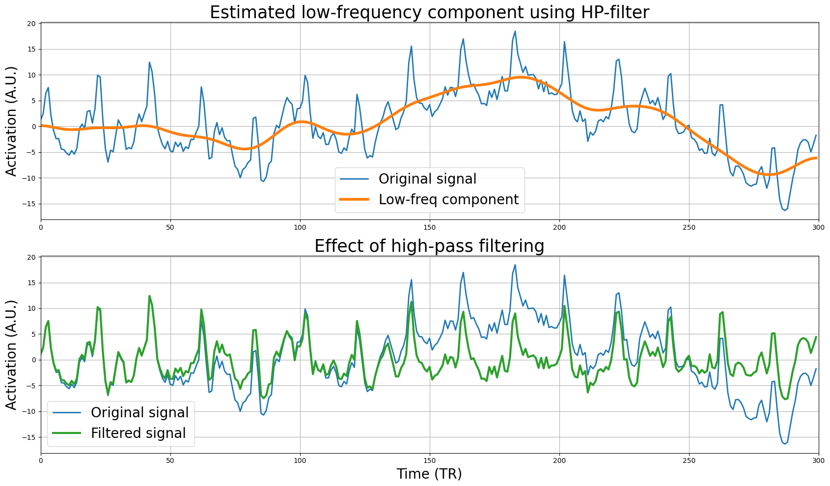
The signal looks much better, i.e., it doesn’t display much drift anymore. But let’s check this by plotting the original and filtered signal in the frequency domain:
plt.figure(figsize=(17, 5))

freq, power = periodogram(sig, fs=0.5)
plt.plot(freq, power, lw=2)

freq, power = periodogram(filt_sig, fs=0.5)
plt.plot(freq, power, lw=2)

plt.xlim(0, freq.max())
plt.ylabel('Power (dB)', fontsize=15)
plt.xlabel('Frequency (Hz)', fontsize=15)
plt.title("The effect of high-pass filtering in the frequency domain", fontsize=20)
plt.legend(["Original signal", "Filtered signal"], fontsize=15)
plt.grid()

plt.show()
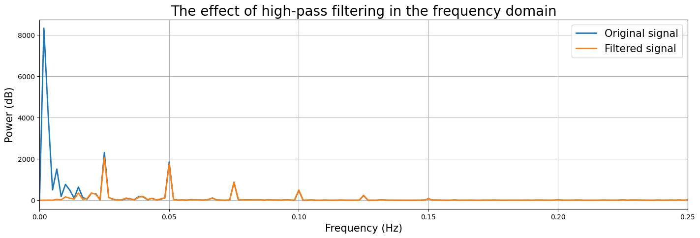
Sweet! It seems that the high-pass filtering worked as expected! But does it really improve our model fit?
# Implement linear regression of X on filt_sig here!

# YOUR CODE HERE
raise NotImplementedError()
''' Tests the above ToDo. '''
from niedu.tests.nii.week_4 import test_mse_with_filter
test_mse_with_filter(X, filt_sig, mse_with_filter)
So far, we’ve filtered only a single (simulated) voxel timeseries. Normally, you want to temporally filter all your voxels in your 4D fMRI data, of course. Below, we load in such a 4D fMRI file (data_4d), which has \(50\) timepoints and (\(80 \cdot 80 \cdot 44 = \)) \(281600\) voxels.
For this assignment, you need to apply the high-pass filter (i.e., the gaussian_filter function; use sigma=25) on each and every voxel separately, which means that you need to loop through all voxels (which amounts to three nested for-loops across all three spatial dimensions). Below, we’ve already loaded in the data. Now it’s up to you write the loops (across spatial dimensions) to filter the signal in the inner-most loop and store it in the pre-allocated data_4d_filt variable (the loop may, if implemented correctly, take about 20 seconds!).
import os.path as op
import nibabel as nib

f = op.join(op.dirname(op.abspath('')), 'week_1', 'func.nii.gz')
print("Loading data from %s ..." % f)
data_4d = nib.load(f).get_fdata()

print("Shape of the original 4D fMRI scan: %s" % (data_4d.shape,))

# Here, we pre-allocate a matrix of the same shape as data_4d, in which
# you need to store the filtered timeseries
data_4d_filt = np.zeros(data_4d.shape)

# YOUR CODE HERE
raise NotImplementedError()
''' Tests the above ToDo. '''
# Test some random indices
np.testing.assert_almost_equal(data_4d_filt[20, 20, 20, 20], -1366.2907714, decimal=3)
np.testing.assert_almost_equal(data_4d_filt[30, 30, 30, 30], -381.6953125, decimal=3)
np.testing.assert_almost_equal(data_4d_filt[40, 40, 40, 40], -269.359375, decimal=3)
Technically, by filtering each column (predictor) in your design matrix as well, you’re orthogonalizing your design matrix with respect to your temporal high-pass filter. If you want to know more about this, check out this excellent paper.
High-pass filtering of fMRI data (option 2)#
As we’ve seen, high-pass filtering using a “running line smoother” is an operation that is applied to the signal directly (before model fitting) to reduce the noise term. Another way to reduce the noise term is to include noise regressors (also called ‘nuisance variables/regressors’) in the design matrix. As such, we can subdivide our design matrix into “predictors of interest” (which are included to model the task/stimuli) and “noise predictors” (which aim to model the thus-far unmodelled variance). These “noise predictors” are also sometimes called “nuisance” predictors/regressors/covariates. We can now slightly reformulate our linear regression equation by dividing our design into two components, \(\mathbf{X}_{\mathrm{interest}}\) and \(\mathbf{X}_{\mathrm{noise}}\):
Importantly, the difference between \(\mathbf{X}_{\mathrm{noise}}\) and \(\epsilon\) is that the \(\mathbf{X}_{\mathrm{noise}}\) term refers to noise-related activity that you are able to model while the \(\epsilon\) term refers to the noise that you can’t model (this is often called the “irreducible noise/error” term).
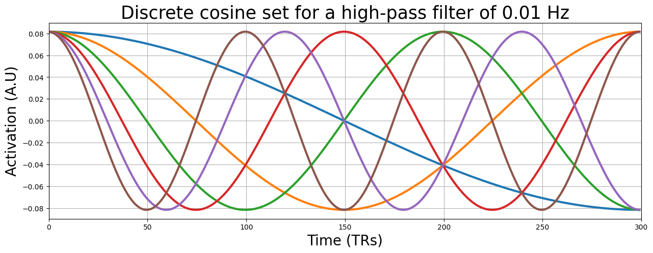
We can use this technique, which we’ll call “nuisance regression” (which we’ll discuss in more detail later), as an alternative to directly high-pass filtering the signal (\(\mathbf{y}\)). One example of this (with respect to high-pass filtering) is including a series of cosines with varying frequencies in your design, which have the same effect as a high-pass filter. This type of filter is called a “discrete cosine (basis) set”. Basically, for any given high-pass cutoff (in hertz), the “discrete cosine transform” (DTC) will yield a set of cosine regressors that is sufficient to filter out any frequency slower than your cutoff.
Fortunately, the nilearn package contains a function to calculate discrete cosine sets:
from nilearn.glm.first_level.design_matrix import _cosine_drift as discrete_cosine_transform
This function takes two arguments: high_pass (in hertz) and frame_times (an array with volume onsets). The signal from the previous examples (sig) was from an experiment lasting 600 seconds and with a TR of 2, so the volume onsets can be defined as follows:
frame_times = np.linspace(0, 600, 300, endpoint=False)
Now, let’s compute a discrete cosine set for a highpass cutoff of 100 seconds (i.e., 0.01 hertz):
dc_set = discrete_cosine_transform(high_pass=0.01, frame_times=frame_times)
dc_set = dc_set[:, :-1]  # remove the (extra) intercept
print(sig.shape)
print(dc_set.shape)
(300,)
(300, 12)
As you can see, the function returns a numpy array with the same number of timepoints as our signal (300) and 12 predictors (we removed the last one, because that’s an intercept). Note that it’s not super important to know how, mathematically, a discrete cosine set is created; it’s more important to understand the idea of adding these low-frequency cosine predictors to your design matrix in order to account for (“explain”) the low-frequency parts of your data.
Let’s plot the discrete cosine set that we created (note: we only plot the first 6 for clarity):
plt.figure(figsize=(15, 5))
plt.plot(dc_set[:, :6], lw=3)
plt.xlim(0, sig.size)
plt.grid()
plt.title("Discrete cosine set for a high-pass filter of 0.01 Hz", fontsize=25)
plt.xlabel("Time (TRs)", fontsize=20)
plt.ylabel("Activation (A.U)", fontsize=20)
plt.show()
""" Implement your ToDo here. """
# YOUR CODE HERE
raise NotImplementedError()
from niedu.tests.nii.week_4 import test_dct_betas
test_dct_betas(X, dc_set, sig, betas_dct)
As you’ve seen in the previous ToDos, it doesn’t really matter which strategy you choose, filtering the signal directly or adding nuisance regressors to the design: both (usually) work equally well.
Autocorrelation and prewhitening#
As you (should) have seen in the previous ToDos, the model fit increases tremendously after high-pass filtering! This surely is the most important reason why you should apply a high-pass filter. But there is another important reason: high-pass filters reduce the signal’s autocorrelation!
“Sure, but why should we care about autocorrelation?”, you might think? Well this has to with the estimation of the standard error of our model, i.e., \(\hat{\sigma}^{2}\mathbf{c}(\mathbf{X}^{T}\mathbf{X})^{-1}\mathbf{c}^{T}\). As you’ve seen in the videos, the Gauss-Markov theorem states that in order for OLS to yield valid estimates (including estimates of the parameters’ standard errors) the errors (residuals) have a mean of 0, have 0 covariance (i.e., are uncorrelated), and have equal variance.
Let’s go through these three assumptions step by step. We’ll use the previously filtered signal for this.
Assumption of zero-mean of the residuals#
First, let’s check whether the mean of the residuals is zero:
b = inv(X.T @ X) @ X.T @ filt_sig
y_hat = X @ b
resids = filt_sig - y_hat
mean_resids = resids.mean()
print("Mean of residuals: %3.f" % mean_resids)
Mean of residuals: -0
YOUR ANSWER HERE
Equal variance of the residuals#
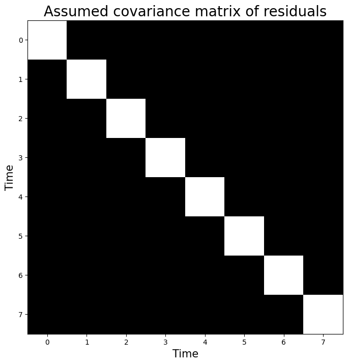
Alright, sweet — the first assumption seems valid for our data. Now, the next two assumptions — about equal variance of the residuals and no covariance between residuals — are trickier to understand and deal with. In the book (and videos), these assumptions are summarized in a single mathemtical statement: the covariance-matrix of the residuals not differ substantially from the identity-matrix (\(\mathbf{I}\)) scaled by the noise-term (\(\hat{\sigma}^{2}\)). Or, put in a formula:
This sounds difficult, so let’s break it down. First off all, the covariance matrix of the residuals is always a symmetric matrix of shape \(N \times N\), in which the diagonal represents the variances and the off-diagonal represents the covariances. For example, at index \([i, i]\), the value represents the variance of the residual at timepoint \(i\). At index \([i, j]\), the value represents the covariance between the residuals at timepoints \(i\) and \(j\).
In OLS, we assume that the covariance matrix of the residuals (\(\mathrm{cov}[\epsilon]\)) matches the identity-matrix (\(\mathbf{I}\)) times the noise-term (\(\hat{\sigma}^{2}\)). The identity-matrix is simply a matrix with all zeros except for the diagonal, which contains ones. For example, the identity-matrix for a residual-array of length \(8\) looks like:
identity_mat = np.eye(8)  # makes an "eye"dentity matrix
print(identity_mat)
[[1. 0. 0. 0. 0. 0. 0. 0.]
 [0. 1. 0. 0. 0. 0. 0. 0.]
 [0. 0. 1. 0. 0. 0. 0. 0.]
 [0. 0. 0. 1. 0. 0. 0. 0.]
 [0. 0. 0. 0. 1. 0. 0. 0.]
 [0. 0. 0. 0. 0. 1. 0. 0.]
 [0. 0. 0. 0. 0. 0. 1. 0.]
 [0. 0. 0. 0. 0. 0. 0. 1.]]
We can also represent this visually:
plt.figure(figsize=(8, 8))
plt.imshow(identity_mat, cmap='gray', aspect='auto')
plt.xlabel("Time", fontsize=15)
plt.ylabel("Time", fontsize=15)
plt.title("Assumed covariance matrix of residuals", fontsize=20)
Text(0.5, 1.0, 'Assumed covariance matrix of residuals')
Now, suppose we calculated that the noise-term of a model explaining this hypothetical signal of length \(8\) equals 2.58 (\(\hat{\sigma}^{2} = 2.58\)). Then, OLS assumes that the noise stems from a covariance matrix estimated from the residuals:
noise_term = 2.58
assumed_cov_resid = noise_term * identity_mat
print(assumed_cov_resid)
[[2.58 0.   0.   0.   0.   0.   0.   0.  ]
 [0.   2.58 0.   0.   0.   0.   0.   0.  ]
 [0.   0.   2.58 0.   0.   0.   0.   0.  ]
 [0.   0.   0.   2.58 0.   0.   0.   0.  ]
 [0.   0.   0.   0.   2.58 0.   0.   0.  ]
 [0.   0.   0.   0.   0.   2.58 0.   0.  ]
 [0.   0.   0.   0.   0.   0.   2.58 0.  ]
 [0.   0.   0.   0.   0.   0.   0.   2.58]]
In other words, this assumption about the covariance matrix of the residuals states that the variance across residuals (the diagonal of the matrix) should be equal and the covariance between residuals (the off-diagonal values of the matrix) should be 0 (in the population).
Now, we won’t explicitly estimate the covariance matrix of the residuals (which is usually estimated using techniques that fall beyond the scope of this course); however, we do want you to understand conceptually how fMRI data might invalidate the assumptions about the covariance matrix of the residuals and how fMRI analyses deal with this (i.e., using prewhitening, which is explained later).
So, let’s check visually whether the assumption of equal variance of our residuals roughly holds for our (simulated) fMRI data. Now, when we consider this assumption in the context of our fMRI data, the assumption of “equal variance of the residuals” (also called homoskedasticity) means that we assume that the “error” in the model is equally big across our timeseries data. In other words, the mis-modelling (error) should be constant over time.
Let’s check this for our data:
plt.figure(figsize=(15, 5))
plt.plot(resids, marker='.')
plt.xlim(0, resids.size)
plt.xlabel("Time (TR)", fontsize=15)
plt.ylabel("Activation (A.U.)", fontsize=15)
plt.title("Residuals", fontsize=20)
plt.axhline(0, ls='--', c='black')
plt.grid()
plt.show()
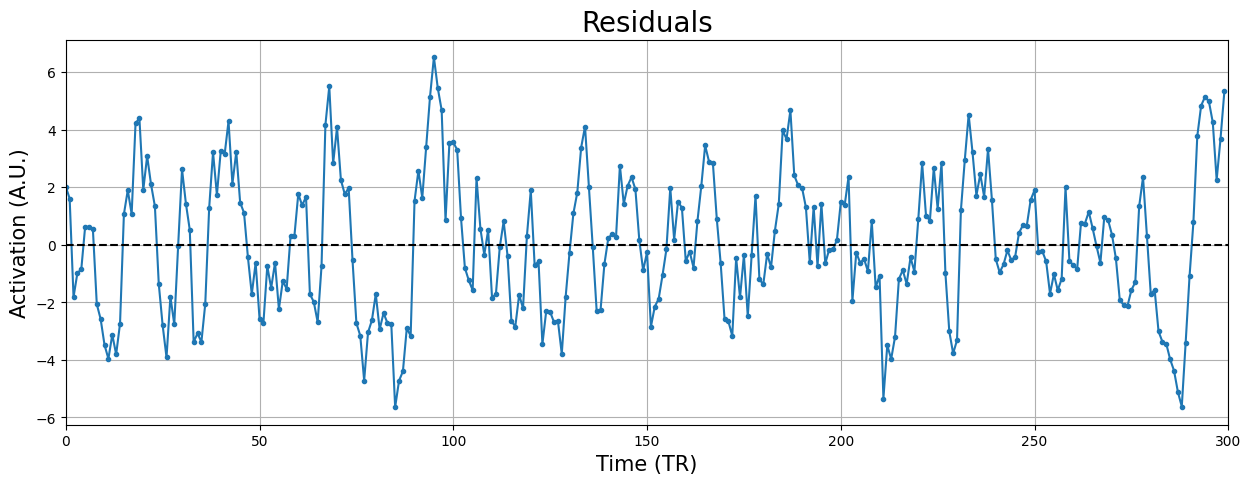
Looks quite alright! Sure, there is some variation here and there, but given that our estimates (including the residuals and their variance!) are imperfect, this suffices.
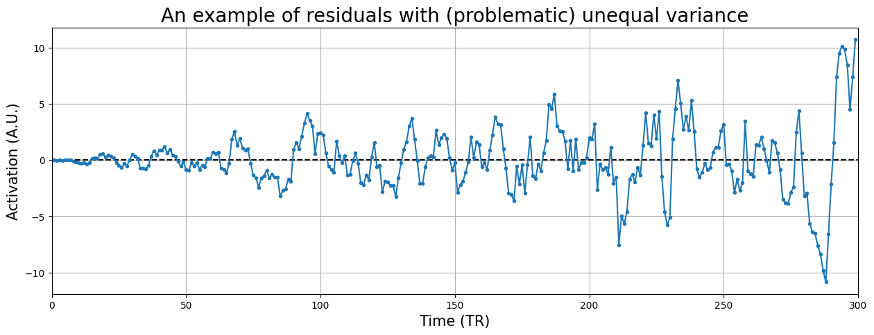
Just to give you some intuition about serious issues with homoskedasticity, check out the (hypothetical) timeseries residuals below:
mfactor = np.linspace(0, 2, sig.size)
example_resids = resids * mfactor

plt.figure(figsize=(15, 5))
plt.xlim(0, sig.size)
plt.xlabel("Time (TR)", fontsize=15)
plt.ylabel("Activation (A.U.)", fontsize=15)
plt.title("An example of residuals with (problematic) unequal variance", fontsize=20)
plt.axhline(0, ls='--', c='black')
plt.plot(example_resids, marker='.')
plt.grid()
plt.show()
YOUR ANSWER HERE
Zero covariance between residuals#
The last assumption of zero covariance between residuals (corresponding to the assumption of all zeros on the off-diagonal elements of the covariance-matrix of the residuals) basically refers to the assumption that there is no autocorrelation (correlation in time) in the residuals. In other words, knowing the residual at timepoint \(i\) does not tell you anything about the residual at timepoint \(i+\tau\), where \(\tau\) reflects a particular “lag” and can be any positive number (up to \(N\)). For example, the “lag 1” autocorrelation (\(\tau = 1\)) is the correlation between the data at timepoints \(i\) and \(i+1\). In OLS, we assume that there is no autocorrelation across all possible lags.
Take for example the residuals of our unfiltered signal from before, which looked like:
b = inv(X.T @ X) @ X.T @ sig
resids_new = sig - X @ b

plt.figure(figsize=(15, 8))
plt.subplot(2, 1, 1)
plt.plot(resids_new, marker='.')
plt.axhline(0, ls='--', c='black')
plt.xlim(0, 200)
plt.xlabel("Time (TR)", fontsize=15)
plt.title('Residuals (containing unmodelled drift!)', fontsize=20)
plt.ylabel('Activity (a.u.)', fontsize=15)
plt.grid()
plt.show()
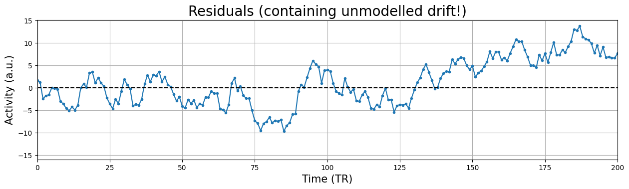
In the above plot, there is clear and strong autocorrelation in the residuals. For example, the residuals are overall getting larger across time (“drift”) and it contains other low-frequency (oscillatory) patterns. As such, we do know something about the residual at timepoint \(i+1\) (and other lags) given the residual at timepoint \(i\), namely that it is likely that the residual at timpoint \(i+1\) is likely lower than the residual at timepoint \(i\)! Therefore, drift is a perfect example of something that (if not modelled) causes autocorrelation in the residuals (i.e. covariance between residuals)! In other words, autocorrelation (e.g. caused by drift) will cause the values of the covariance matrix of the residuals at the indices \([i, i+1]\) to be non-zero, violating the third assumption of Gauss-Markov’s theorem!
We stated that autocorrelation captures the information that you have of the residual at timepoint \(i+\tau\) given that you know the residual at timepoint \(i\). Practically, you can compute the autocorrelation (or actually, autocovariance) for a particular lag \(\tau\) by computing the covariance of the residuals with the lag-\(\tau\) shifted version of itself. In general, the autocovariance for the residuals \(\epsilon\) with lag \(\tau\) is calculated as:
Jeanette Mumford explains how to do this quite clearly in her video on prewhitening (around minute 10). For this ToDo, calculate the covariance (with \(\tau = 1\)) between the residuals (i.e., using the variable resids_new) and store this in a variable named lag1_cov.
# Implement your ToDo here

# YOUR CODE HERE
raise NotImplementedError()
''' Tests the above ToDo. '''
from niedu.tests.nii.week_4 import test_lag1_cov
test_lag1_cov(resids_new, lag1_cov)
Accounting for unequal variance and autocorrelation: prewhitening#
So, in summary, if the covariance matrix of your residuals appear to significantly deviate from the identity-matrix scaled by the noise-term (\(\mathrm{cov}[\epsilon] = \hat{\sigma}^{2}\mathbf{I}\)) — either due to unequal variance or non-zero covariance — your estimate of the variance term of your effects (\(\mathrm{var}[c\hat{\beta}]\)) will be incorrect.
Unfortunately, even after high-pass filtering (which corrects for most but not all autocovariance), the covariance matrix of the residuals of fMRI timeseries usually do no conform to the Markov-Gauss assumptions of equal variance and zero covariance. Fortunately, some methods have been developed by statisticians that transform the data such that the OLS assumptions hold again. One such technique is called prewhitening.
Prewhitening uses an estimate of the error covariance matrix — usually denoted by \(\mathbf{V}\) — to account for possible unequal variance and/or autocovariance of the residuals. The matrix \(\mathbf{V}\) is an \(N \times N\) matrix (\(N\) referring to the number of timepoints of your signal), and may be estimated using different techniques, with names such as “ARMA”, “AR(1)”, and “REML”. In this course, we won’t discuss these techniques and instead assume that your software of choice (FSL, AFNI, SPM) has computed an accurate estimate of \(\mathbf{V}\) for you already. But if you’re up for a (programming) challenge, you can do the optional ToDo below.
The “AR(1)” method is a relatively “easy” way to estimate \(\mathbf{V}\). It computes only a single parameter, the lag-1 correlation (not covariance!). Then, it assumes that the correlation decreases exponentially as a function of lag:
where \(\phi\) is the estimated lag-1 correlation. For example, for \(\phi = 0.9\), \(\mathbf{V}\) would look like:
Compute the lag-1 correlation below and create the corresponding AR(1) matrix of the residuals (resids_new) and store this in a variable named V_ar1 (do not use the toeplitz function for this).
''' Implement the (optional) ToDo here.'''
# YOUR CODE HERE
raise NotImplementedError()
''' Tests the optional ToDo above. '''
from scipy.linalg import toeplitz
phi = (t0 - t0.mean()) @ (t1 - t1.mean()) / np.sqrt(np.sum((t0 - t0.mean()) ** 2) * np.sum((t1 - t1.mean()) ** 2))
V_ans = phi ** toeplitz(np.arange(resids_new.size))
np.testing.assert_array_almost_equal(V_ans, V_ar1)
print("Well done!")
Suppose you have a signal of 20 timepoints (an irrealistically low number, but just ignore that for now) and that you already estimated the covariance matrix of the residuals of this signal. Now, suppose you take a look at it and you notice that it looks faaaaar from the identity-matrix (\(\mathbf{I}\)) that we need for OLS.
For example, you might see this:
N = 20
phi = 0.7
V = phi ** toeplitz(np.arange(N))
# This will increase variance over time
V[np.diag_indices_from(V)] += np.linspace(0, 1, V.shape[0])

fig, axes = plt.subplots(ncols=2, sharex=True, sharey=True, figsize=(15, 8))
axes[0].imshow(V, vmax=2, cmap='gray', aspect='auto')
axes[0].set_title("V (actual covariance matrix)", fontsize=25)
axes[0].set_xlabel('Time (volumes)', fontsize=20)
axes[0].set_ylabel('Time (volumes)', fontsize=20)

axes[1].imshow(np.eye(N), vmax=2, cmap='gray', aspect='auto')
axes[1].set_title("Identity-matrix (assumed matrix)", fontsize=25)
#axes[1].colorbar()
axes[1].set_xlabel('Time (volumes)', fontsize=20)

fig.tight_layout()
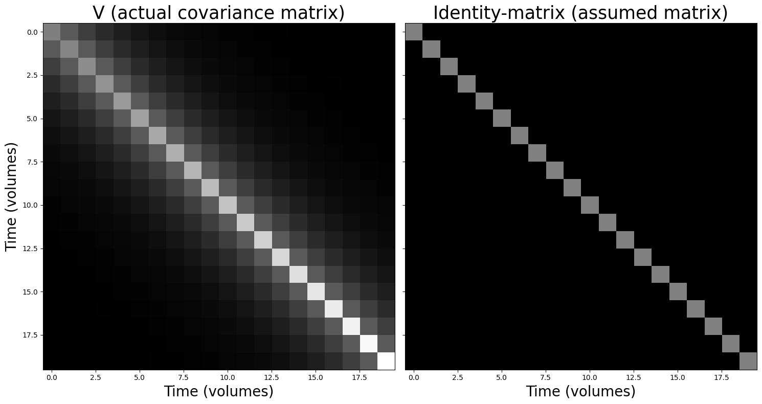
Well, shit. We have both unequal variance (different values on the diagonal) and non-zero covariance (some non-zero values on the off-diagonal). So, what to do now? Well, we can use the technique of prewhitening to make sure our observed covariance matrix (\(\mathbf{V}\)) will be “converted” to the identity matrix! Basically, this amounts to plugging in some extra terms to formula for ordinary least squares. As you might have seen in the book/videos, the original OLS solution (i.e., how OLS finds the beta-parameters is as follows):
Now, given that we’ve estimated our covariance matrix of the residuals, \(\mathbf{V}\), we can rewrite the OLS solution such that it prewhitens the data (and thus the covariance matrix of the residuals will approximate \(\hat{\sigma}^{2}\mathbf{I}\)) as follows:
Then, accordingly, the standard-error of any contrast of the estimated beta-parameters becomes:
This “modification” of OLS is also called “generalized least squares” (GLS) and is central to most univariate fMRI analyses! You don’t have to understand how this works mathematically; again, you should only understand why prewhitening makes sure that our data behaves according to the assumptions of the Gauss-Markov theorem.
(Fortunately for us, there is usually an option to ‘turn on’ prewhitening in existing software packages, so we don’t have to do it ourselves. But it is important to actually turn it on whenever you want to meaningfully and in an unbiased way interpret your statistics in fMRI analyses!)
# Implement your ToDo here!
some_sig = sig[:20]  # y
some_X = X[:20, :]   # X
c_vec = np.array([0, 1])  # the contrast you should use

# YOUR CODE HERE
raise NotImplementedError()
''' Tests the optional ToDo above '''
from niedu.tests.nii.week_4 import test_gls_todo
test_gls_todo(some_sig, some_X, V, c_vec, betas_gls, tval_gls)
When it comes to estimating parameters from data with unequal (co)variance, OLS actually still gives you unbiased parameters: on average, they will be correct. However, OLS is not the estimator with least variance anymore, meaning that it is less “precise” (it is not the “Best Linear Unbiased Estimator” anymore; still unbiased, but not the “best”). In fact, with unequal (co)variance, GLS is the best unbiased linear estimator. A good way to build intuition about this is to iteratively generate data with known parameters (the “true betas”, \(\beta\), “sigma squared”, \(\sigma^{2}\), and \(V\)) and to estimate the parameters back from the generated data. Then, you can plot the histograms of the parameters and you’ll see that, on average, the estimated parameters are the same as the true parameters.
Below, we set up such a “simulation” loop for you. We define the true parameters (true_betas, siqsq, V). Now, if you’re up to the challenge, complete the loop by:
Generating some random design matrix (e.g., using np.random.normal of size (N, 1));
Stack an intercept
Generate correlated noise using the np.random.multivariate_normal function (with cov=V);
Generate the data using the formula \(X\beta + \mathrm{noise}\);
Estimate the OLS parameters, and store in betas_ols;
Estimate the GLS parameters, and store in betas_gls;
In the next cell, plot both parameters (betas_ols[:, 1] and betas_gls[:, 1]) as histograms
Do the histograms look like you expected? Also, try changing the phi parameter, which controls the amount of autocorrelation in the data (it’s the AR1 parameter which is used to create V). What happens to the difference between OLS and GLS?
true_betas = np.array([0, 1])
iters = 100

N = 50
phi = 0.8  # AR1 parameter
sigsq = 2
V = sigsq * phi ** toeplitz(np.arange(N))

betas_ols = np.zeros((iters, 2))
betas_gls = np.zeros((iters, 2))

for i in range(iters):
    # YOUR CODE HERE
    raise NotImplementedError()
# YOUR CODE HERE
raise NotImplementedError()
(More on) nuisance regression#
Let’s go back to the technique of nuisance regression. We have seen before that this technique can be used to model low-frequency components in our data (effectively functioning as a high-pass filter), but it can, in general, be used to model any thus-far unmodelled variance in the signal that would otherwise end up in the noise term. For example, people use this technique to model variance due to physiological processes (such cardiac and respiratory related signals; see e.g. Glover et al., 2000), motion-related variance (which we’ll discuss later), and high-intensity “spikes”. To get a better feel for nuisance regression and its consequences, let’s look at this process of removing high-intensity spikes (which is sometimes called “despiking”).
Using nuisance regression for despiking#
This technique of adding noise-predictors to the design matrix is sometimes used to model ‘gradient artifacts’, which are also called ‘spikes’ (which you’ve heard about in one of the videos for this week). This technique is also sometimes called “despiking”. These spikes reflect sudden large intensity increases in the signal across the entire brain that likely reflect scanner instabilities. One way to deal with these artifacts is to “censor” bad timepoints (containing the spike) in your signal using a noise predictor.
But what defines a ‘spike’/bad timepoint? One way is to compute the normalized “root mean square successive differences” (RMSSD), normalizing this, and imposing some threshold above which a timepoint is marked as a spike (technically, it’s a little bit more complex, but we’ll ignore that for now).
We’ll delve into the details of this computation later. For now, let’s take a look at some example data that we’re going to use for this section:
with np.load('spike_data.npz') as spike_data:
    all_sig = spike_data['all_sig']
    pred = spike_data['pred']

print("Shape of all_sig: %s" % (all_sig.shape,))
print("Shape of pred: %s" % (pred.shape,))
Shape of all_sig: (10, 10, 10, 500)
Shape of pred: (500, 1)
The example data all_sig is a (simulated) 4D fMRI scan with \(10 \times 10 \times 10\) voxels and 500 timepoints (assuming a TR of 2, this amounts to a duration of 1000 seconds). The predictor reflects a design in which the participants was shown a stimulus every 100 seconds (50 TRs). Let’s plot the predictor:
plt.figure(figsize=(15, 5))
plt.plot(pred)
plt.grid()
plt.xlabel('Time (TRs)', fontsize=20)
plt.ylabel('Activation (A.U.)', fontsize=20)
plt.show()
Alright, now let’s take a look at how you would calculate the “root mean square successive differences” (RMSSD). This quantity reflects the difference between every timepoint \(t\) of your signal and the signal at timepoints \(t-1\), which is then squared, averaged (across all voxels, \(1 \dots K\)), after which the square root is taken:
First, let’s focus on the “successive differences”. Suppose we have only one “signal” of length 5:
ex_sig = np.array([1, 3, -2, 0, 5])
The “successive differences” are the difference between 3 and 1, -2 and 3, 0 and -2, and 5 and 0. Note that the successive difference for the first timepoint (\(t=0\)) is not defined! In code, we can compute this with:
succ_diff = ex_sig[1:] - ex_sig[:-1]
print(succ_diff)
[ 2 -5 2 5]
After computing the successive differences, we need to do another thing. As we noted earlier, RMSSD is not defined for \(t=0\) (because there is no \(t-1\) for the first timepoint). We can insert a duplicate of the first value here for convenience.
succ_diff = np.insert(succ_diff, 0, succ_diff[0])
# Compute the sucessive differences here
# YOUR CODE HERE
raise NotImplementedError()
''' Tests the above ToDo (optional). '''
from niedu.tests.nii.week_4 import test_rmssd
test_rmssd(all_sig, all_sig_rmssd)
Now, in order to identify spikes, we need to identify timepoints that have a RMSSD-values that differ more than (let’s say) 7 standard deviations from the mean RMSSD value. As such, you need to ‘z-score’ the RMSSD values: subtract the mean value from each individual value and divide each of the resulting ‘demeaned’ values by the standard deviation (\(\mathrm{std}\)) of the values. In other words, the z-transform of any signal \(s\) with mean \(\bar{s}\) is defined as:
Implement this z-score transform for the variable all_sig_rmssd and store it in the variable z_rmssd (1 point). Then, plot the z-scored RMSSD signal (with appropriate axis labels; 1 point).
# Let's load the correct answer from the previous optional ToDo
# in case you didn't do it
all_sig_rmssd = test_rmssd(all_sig, None, check=False)

# Implement the z-scoring below
# YOUR CODE HERE
raise NotImplementedError()
''' Tests part 1 of ToDo. '''
from niedu.tests.nii.week_4 import test_zscore_rmssd
test_zscore_rmssd(all_sig_rmssd, z_rmssd)
# Now, plot the zscored rmssd signal (z_rmssd)!
# YOUR CODE HERE
raise NotImplementedError()
Now, we can set a threshold above which we define timepoints as “spikes”. Let’s say we do this for \(z > 7\).
# Load the correct answer from the previous (optional) ToDo
from niedu.tests.nii.week_4 import test_zscore_rmssd
z_rmssd = test_zscore_rmssd(all_sig_rmssd, None, check=False)

identified_spikes = z_rmssd > 7  # creates array with True/False
n_spike = identified_spikes.sum()
print("There are %i spikes in the data!" % n_spike)
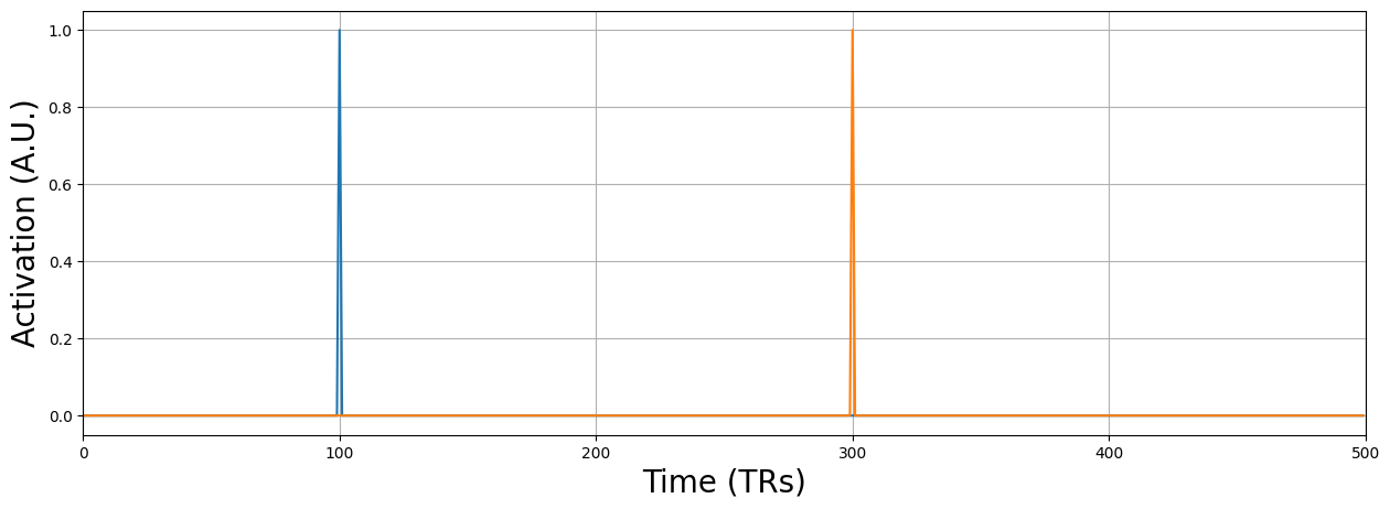
Now, to remove this influence, we can simply add a nuisance predictor for each spike, in which the predictor contains zeros at timepoints without the spike and 1 at the timepoint with a spike.
spike_pred = np.zeros((pred.size, n_spike))
t_spikes = np.where(identified_spikes)[0]
for i, t in enumerate(t_spikes):
    print("Creating spike predictor for t = %i" % t)
    spike_pred[t, i] = 1

plt.figure(figsize=(15, 5))
plt.plot(spike_pred)
plt.xlabel("Time (TRs)", fontsize=20)
plt.ylabel("Activation (A.U.)", fontsize=20)
plt.grid()
plt.xlim(0, pred.size)
plt.show()
Creating spike predictor for t = 100
Creating spike predictor for t = 300
Why do you think we do not convolve the spike regressors with an HRF (or basis set)? Write your answer in the text-cell below.
YOUR ANSWER HERE
# Calculate the t-value of the model with only an intercept + stim predictor
spike_sig = all_sig[5, 5, 5, :]

# YOUR CODE HERE
raise NotImplementedError()
''' Tests the above ToDo. '''
from niedu.tests.nii.week_4 import test_spike_model
test_spike_model(pred, spike_pred, spike_sig, tval_spike_model)
YOUR ANSWER HERE