6 Explainable models of facial movements predict emotion perception behavior
Abstract
Since Darwin, many studies have proposed how action units (AUs) relate to categorical emotions, giving rise to a multitude of hypothesized AU-emotion mappings. The qualitative nature of these mappings prevent us from quantifying to what extent these AU-based mappings explain categorical emotions. Here, we formalize these qualitative mappings as quantitative, predictive models that are able to precisely quantify the importance and limitations of AUs for emotion perception. We use a state-of-the-art modelling approach to compare these models in their capacity to predict human emotion classification behavior, explain the role of each AU, and explore how models can be improved. Additionally, by estimating the noise ceiling of predictive models, we estimate the limitations of these AU-based models due to individual differences. Together, our approach enables rigorous testing of different models, which quantifies the importance and limitations of AU-based models and proposes how to proceed in building better models of emotion perception.6.1 Introduction
Facial expressions are a powerful and efficient medium to express and transmit a wide variety of emotions (Jack & Schyns, 2015). Since the pioneering work of Ekman and Friesen (Ekman & Friesen, 1976; Friesen & Ekman, 1978), studies have attempted to describe and quantify the relationship between facial expressions and emotions. Central to this endeavor are “action units” (AUs) — the smallest visually discriminable movements of the face (J. F. Cohn et al., 2007). Many studies have proposed that specific combinations of AUs represent different categorical emotions (Barrett et al., 2019; Matsumoto et al., 2008). For example, Friesen & Ekman (1978) proposed that the facial expression of anger comprises Brow Lowerer (AU4), Upper Lid Raiser (AU5), Lid Tightener (AU7), and Lip Tightener (AU23). Such mappings between combinations of AUs and emotions are supposedly largely invariant to individual differences (Ekman & Keltner, 1997; Izard, 1994; Matsumoto et al., 2008), implying that facial expressions conforming to the hypothesized AU combination will be consistently interpreted as the associated emotion. However, the importance of AUs in emotion perception and the invariance of the AU-emotion mappings is still debated (Barrett et al., 2019; Jack et al., 2012, 2009).
6.1.1 The prediction-explanation-exploration framework
To compare different combinations of AUs in relation to categorical perception of emotions, one would need to directly and quantitatively compare the mappings hypothesized in different theories. In mature scientific endeavors, evaluating and comparing hypotheses is done using formal models, which can be quantitatively assessed by how accurately they are able to predict phenomena. In addition, models are used to explain the underlying causes of phenomena, and, with the enhanced understanding these explanations can provide, allow us to explore new predictions about the phenomenon (see Figure 6.1). Most AU-emotion mappings, however, are not based or estimated from an explicit model, but are based on statistical tests between single AUs and discrete emotions (Cordaro et al., 2018; Ekman et al., 1980; Jack et al., 2012; Wiggers, 1982). The result describes a hypothesized relationship between a combination of AUs and a categorical emotion, which requires further developments to become formally predictive. We address this development with a novel methodology that formalizes descriptive hypotheses, such as AU-emotion mappings, as predictive models of classification (see Methods). To evaluate these formal models, we quantify how well they predict the representation of emotions (via their behavioral classification performance), explain how different AUs contribute to these causal representations, and explore how we can improve existing models using insights from the derived explanations.
This prediction-explanation-exploration framework (see Figure 6.1) is a rigorous methodology to estimate the proportion of variance in categorization behavior that can be attributed to the AU models of the emotions vs. cannot be attributed the models themselves. We estimated the latter with the component of behavioral variance that arises from individual differences in the interpretation of the AU combinations — i.e., the noise ceiling (Lage-Castellanos et al., 2019; Nili et al., 2014). The noise ceiling proposes that a fixed model cannot, by definition, explain any variations between individuals who categorize facial expressions with this model. Here, we use noise ceilings to demonstrate the limitations of fixed, AU-based models of categorical emotions.
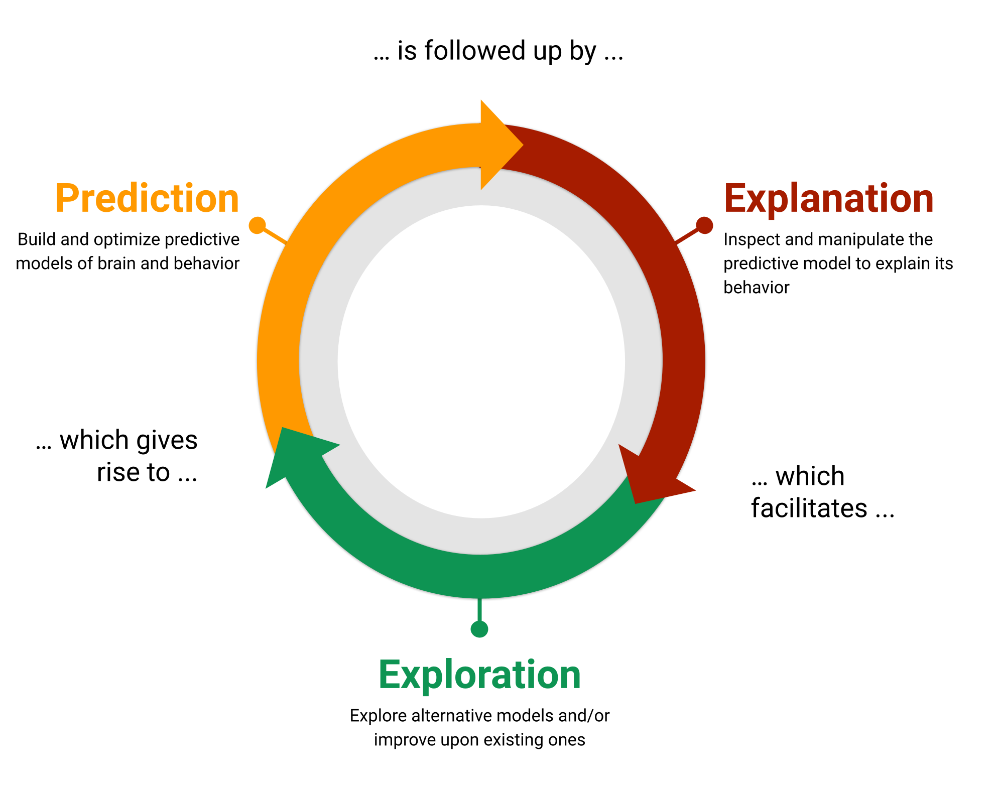
Figure 6.1: The modelling framework used in the current study, which uses models for prediction, explanation, and exploration.
We tested the ability of seven influential models of facial expressions of the six classic categorical emotions (see Methods and Table 6.1) to predict categorical emotion labels. To do so, we used a psychophysics task containing a large set of dynamic facial expressions with random AU combinations. In this task, participants categorized each facial expression animation as one of the six classic emotions, or “don’t know.” We used the models to predict, for the same trials rated by the participants, the most likely emotion category, which were compared to the actual emotion ratings. Next, to explain how specific AUs contributed to emotion classification performance, we systematically removed individual AUs from each model and recomputed its performance in predicting human behavior. Finally, we used these performance critical AUs to explore whether they improved the predictions of models that do not represent them. We show that models of the AU-emotion relationship substantially improve their prediction performance when they comprise performance-critical AUs. However, because this performance remains below the noise ceiling, there is still model variance to explain, suggesting that the evaluated hypotheses AU-emotion relations tested are not optimal yet. Importantly, these noise ceilings indicate that individual differences contribute a large proportion of the variations in emotion categorizations, suggesting better models that include between-participant factors, such as culture and other perceiver-related characteristics.
6.2 Methods
6.2.1 Hypothesis kernel analysis
To formalize AU-emotion mappings as predictive models, we propose a novel method which we call “hypothesis kernel analysis”. In the context of the current study, we use this method to reframe AU-emotion mappings as classification models that predict the probability of an emotion given a set of AUs (analogous to how people attempt to infer the emotion from others’ facial emotion expressions; Jack & Schyns, 2015). In what follows, we conceptually explain how the method works. For a detailed and more mathematical description of the method, we refer the reader to the Supplementary Methods.
The underlying idea of the hypothesis kernel analysis is to predict a categorical dependent variable (e.g., the perceived emotion) based on the similarity between an observation with a particular set of features (e.g., a face with a particular set of AUs; the independent variables) and statements of a hypothesis (e.g., “happiness is expressed by AUs 6 and 12”). This prediction can then be compared to real observations to evaluate the accuracy of the hypothesis. The three methodological challenges of this approach are how to measure the similarity between an observation and a hypothesis statement, how to derive a prediction based on this similarity, and how to compare the predictions to real data. Figure 6.2 outlines how we have solved these challenges in five steps, which we will describe in turn.
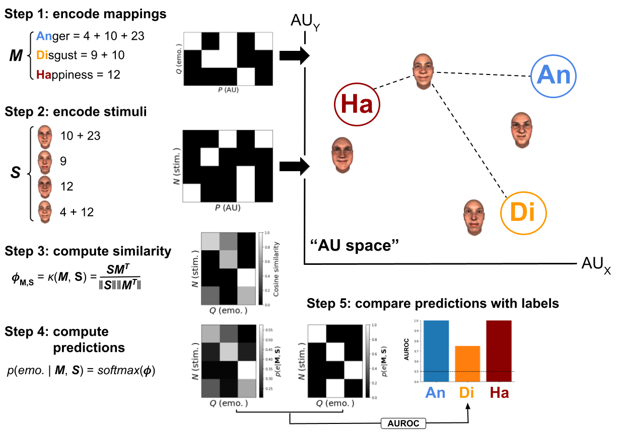
Figure 6.2: Schematic visualization of the proposed method using a set of hypothetical AU-emotion mappings (\(\mathbf{M}\)) and stimuli (\(\mathbf{S}\)) based on a small set of AUs (five in total). The variable \(P\) represents the number of variables (here: AUs), \(Q\) represents the number of classes (here: emotions), and \(N\) represents the number of trials (here: facial expression stimuli). Note that the AU space technically may contain any number of (\(P\)) dimensions, but is shown here in two dimensions for convenience.
To quantify the similarity between an observation and a hypothesis statement, we embed both in a multidimensional space that is spanned by a particular set of variables (e.g., different AUs). In this space, we start by representing each class of the dependent variable (corresponding to the statements of the hypothesis) as a separate point. In the current study, this amounts to embedding the different hypothesized AU configurations (e.g., “happiness = AU12 + 6”; \(\mathbf{M}\) in Figure 6.2) as points in “AU space”, separately for each categorical emotion (see step 1 in Figure 6.2). The coordinates of each point are determined by the hypothesized “importance” of each independent variable for that given class of the target variable. For example, the coordinates of each point in AU space represents the hypothesized relative intensity of each AU for a given emotion. As the AU-emotion mappings evaluated in the current study only specify whether an AU is included or excluded within a particular emotional configuration, we specify the coordinates of their embedding to be binary (0: excluded, 1: included). A different interpretation of the class embeddings described here is that they represent the location of a typical facial expression for this emotion in “AU space” according to a particular hypothesis.
As a second step, we embed each data point in the same space as the hypotheses. This means, the data used for this purpose should contain the same variables as were used to embed the hypotheses. For example, in this study, we use emotion ratings (i.e., the target variable) in response to dynamic facial expression stimuli with random configurations of AUs (i.e., the independent variables; \(\mathbf{S}\) in Figure 6.2) to test the hypothesized AU-emotion mappings (see Dataset used to evaluate mappings).
With the hypotheses and the data in the same space, the next step in our method is to compute, for each observation separately, the “similarity” between the data and each class of the target. For this purpose, we use kernel functions (step 3 in Figure 6.2), a technique that quantifies the similarity of two vectors. Any kernel function that computes a measure of similarity can be used, but in our analyses we use the cosine similarity as it normalizes the similarity by the magnitude (specifically, the L2 norm) of the data and hypothesis embeddings (but see Supplementary Figure E.3 for a comparison of model performance across different similarity and distance metrics).
As a fourth step, we interpret the similarity between the data and a given class embedding as being proportional to the evidence for a given class. In other words, the more similar a data point is to the statement of a hypothesis the stronger the prediction for the associated class. To produce a probabilistic prediction of the classes given a particular observation and hypothesis, we normalize the similarity values to the 0-1 range using the softmax function (step 4 in Figure 6.2).17
Finally, the accuracy of the model can be summarized by comparing its predictions to the actual values of the target variable in the dataset (see step 5 in Figure 6.2). In this study, this means that the predictions are compared to the actual emotion ratings from participants. Although any model performance metric can be used, we use the “Area under the Receiver operating curve” (AUROC) as our model performance metric, because it is insensitive to class imbalance, allows for class-specific scores, and can handle probabilistic predictions (Dinga et al., 2020). We report class-specific scores, which means that each class of the categorical dependent variable (i.e., different emotions) gets a separate score with a chance level of 0.5 and a theoretical maximum score of 1.
6.2.2 Ablation and follow-up exploration analyses
To gain a better understanding of why some mappings perform better than others, we performed an “ablation analysis”, which entails removing (or “ablating”) AUs one by one from each configuration for each evaluated mapping and subsequently rerunning the kernel analysis to observe how this impacts model performance. If ablating a particular AU decreases model performance for a given emotion, it means that this AU is important for perceiving this emotion. If on the other hand ablating an AU increases performance for a given emotion, it could mean that the inclusion of this AU in a given mapping is incorrect.
Using the results from the ablation analyses, we explored strategies to enhance existing mappings. Specifically, we computed for each emotion which AUs, on average across mappings, led to a decrease in model performance after being ablated. We then constructed “optimized” models by, for each mapping separately, adding all AUs that led to a decrease in model performance after ablation and removing all AUs that led to an increase in model performance after ablation. Then, the predictive analysis was rerun and the “optimized” model performance was compared to the original model performance.
6.2.3 Noise ceiling estimation
Instead of interpreting model performance relative to the theoretical optimum performance, we propose to interpret model performance relative to the noise ceiling, an estimate of the in principle explainable portion of the target variable. The noise ceiling is a concept often used in systems neuroscience to correct model performance for noise in the measured brain data (Hsu et al., 2004; Huth et al., 2012; Kay et al., 2013). Traditionally, noise ceilings in neuroscience are applied in the context of within-subject regression models (Lage-Castellanos et al., 2019). Here, we develop a method to derive noise ceilings for classification models, i.e., models with a categorical target variable (such as categorical emotion ratings) that are applicable to both within-subject and between-subject models (see also Hebart et al., 2020). In this section, we explain our derivation of noise ceilings for classification models conceptually; the Supplementary Methods outline a more detailed and formal description.
Noise ceiling estimation is a method that adjusts the theoretical maximum performance of a predictive model for the presence of irreducible noise in the data. As such, like the theoretical maximum, the noise ceiling imposes an upper bound on model performance. Another way to think about noise ceilings is that they split the variance of the data into three portions: the explained variance, the unexplained variance, and the “irreducible” noise (see Figure 6.3). “Irreducible” is put in quotes because this proportion of noise can, in fact, be explained in principle as will be discussed in the Discussion (see also the Supplementary Methods. Importantly, the noise ceiling thus indicates how much improvement in terms of model performance can be gained for a given dataset (i.e., unexplained variance) and how much cannot be explained by the model (i.e., the “irreducible” noise).
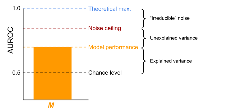
Figure 6.3: The noise ceiling partitions the variance into explained variance, unexplained variance, and “irreducible” noise for any given model (\(\mathbf{M}\)). Here, AUROC is used as the metric of model performance, but the noise ceiling can be estimated using any metric.
In the context of the current study, we use the variance (or “inconsistency”) in emotion ratings across participants in response to the same set of facial expression stimuli to estimate a noise ceiling for the different AU-based models. The noise ceiling gives us insight into whether the evaluated set of AU-based models are sufficiently accurate to explain variance that can in principle be explained by AUs or whether we may need differently parameterized AU-based models. This way, the importance and limitations of AUs can be estimated empirically.
6.2.4 Evaluated mappings
Many different AU-emotion mappings have been put forward, but in this study we assess those summarized in Barrett et al. (2019) (Table 1). Additionally, we included the AU-emotion mappings from the “emotional FACS” (EMFACS) manual (Friesen & Ekman, 1983). So, in total, we evaluated six hypothesized AU-emotion mappings, which are summarized in Table 6.1 (and an additional data-driven AU-emotion mapping, see below).
| Emotion category | Darwin (1872) | EMFACS | Matsumoto et al. (2008) | Cordaro et al. (2018) - ref. | Cordaro et al. (2018) - ICP | Keltner et al. (2019) | Jack/Schyns |
|---|---|---|---|---|---|---|---|
| Anger | 4 + 5 + 24 + 38 | \(\boldsymbol{\cdot}\) 4 + 5 + 7 + 10 + 22 + 23 + (25 \(\lor\) 26) | 4 + (5 \(\lor\) 7) + 22 + 23 + 24 | 4 + 5 + 7 + 23 | 4 + 7 | 4 + 7 | 4 + 5 + 17 + 23 +24 |
| \(\boldsymbol{\cdot}\) 4 + 5 + 7 + 10 + 23 + (25 \(\lor\) 26) | |||||||
| \(\boldsymbol{\cdot}\) 4 + 5 + 7 + 17 + (23 \(\lor\) 24) | |||||||
| \(\boldsymbol{\cdot}\) 4 + 5 + 7 + (23 \(\lor\) 24) | |||||||
| \(\boldsymbol{\cdot}\) 4 + (5 \(\lor\) 7) | |||||||
| \(\boldsymbol{\cdot}\) 17 + 24 | |||||||
| Disgust | 10 + 16 + 22 + 25 + 26 | \(\boldsymbol{\cdot}\) (9 \(\lor\) 10) + 17 | (9 \(\lor\) 10), (25 \(\lor\) 26) | 9 + 15 + 16 | 4 + 6 + 7 + 9 + 10 + 25 + (26 \(\lor\) 27) | 7 + 9 + 19 + 25 + 26 | 9 + 10 + 11 + 43 |
| \(\boldsymbol{\cdot}\) (9 \(\lor\) 10) + 16 + (25 \(\lor\) 26) | |||||||
| \(\boldsymbol{\cdot}\) (9 \(\lor\) 10) | |||||||
| Fear | 1 + 2 + 5 + 20 | \(\boldsymbol{\cdot}\) 1 + 2 + 4 | 1 + 2 + 4 + 5 + 20, (25 \(\lor\) 26) | 1 + 2 + 4 + 5 + 20 + 25 + 26 | 1 + 2 + 5 + 7 + 25 + (26 \(\lor\) 27) | 1 + 2 + 4 + 5 + 7 + 20 + 25 | 4 + 5 + 20 |
| \(\boldsymbol{\cdot}\) 1 + 2 + 4 + 5 + 20 + (25 \(\lor\) 26 \(\lor\) 27) | |||||||
| \(\boldsymbol{\cdot}\) 1 + 2 + 4 + 5 | |||||||
| \(\boldsymbol{\cdot}\) 1 + 2 + =5 + (25 \(\lor\) 26 \(\lor\) 27) | |||||||
| \(\boldsymbol{\cdot}\) 5 + 20 + (25 \(\lor\) 26 \(\lor\) 27) | |||||||
| \(\boldsymbol{\cdot}\) 5 + 20 | |||||||
| \(\boldsymbol{\cdot}\) 20 | |||||||
| Happiness | 6 + 12 | \(\boldsymbol{\cdot}\) 12 | 6 + 12 | 6 + 12 | 6 + 7 + 12 + 16 + 25 + (26 \(\lor\) 27) | 6 + 7 + 12 + 25 + 26 | 6 + 12 + 13 + 14 +25 |
| \(\boldsymbol{\cdot}\) 6 + 12 | |||||||
| Sadness | 1 + 15 | \(\boldsymbol{\cdot}\) 1 + 4 | 1 + 15, 4, 17 | 1 + 4 + 5 | 4 + 43 | 1 + 4 + 6 + 15 + 17 | 4 + 15 + 17 + 24 + 43 |
| \(\boldsymbol{\cdot}\) 1 + 4 + (11 \(\lor\) 15) | |||||||
| \(\boldsymbol{\cdot}\) 1 + 4 + 15 + 17 | |||||||
| \(\boldsymbol{\cdot}\) 6 + 15 | |||||||
| \(\boldsymbol{\cdot}\) 11 + 17 | |||||||
| \(\boldsymbol{\cdot}\) 1 | |||||||
| Surprise | 1 + 2 + 5 + 25 + 26 | \(\boldsymbol{\cdot}\) 1 + 2 + 5 + (26 \(\lor\) 27) | 1 + 2 + 5 + (25 \(\lor\) 26) | 1 + 2 + 5 + 26 | 1 + 2 + 5 + 25 + (26 \(\lor\) 27) | 1 + 2 + 5 + 25 + 26 | 1 + 2 + 5 + 26 + 27 |
| \(\boldsymbol{\cdot}\) 1 + 2 + 5 | |||||||
| \(\boldsymbol{\cdot}\) 1 + 2 + (26 \(\lor\) 27) | |||||||
| \(\boldsymbol{\cdot}\) 5 + (26 \(\lor\) 27) | |||||||
| Note: Mappings evaluated in the current study. The mappings from Darwin (1872) were taken from Matsumoto et al. (2018). Both the “reference configuration” (ref.) and the “international core pattern” (ICP) from Cordaro et al. (2018) are included. The + symbol means that AUs occur together. AUs following a comma represent optional AUs. The inverted ^ symbol represents “or”. When multiple configurations are explicitly proposed for a given emotion (i.e., a “many-to-one” mapping), they are represented as separate bullet points. |
All of these mappings propose that a number of AUs must occur together to communicate a particular emotion. However, the comparison between them is complicated by the fact that not all of them posit a single, consistent set of AUs per emotion. First, some contain multiple sets, such as the EMFACS manual (Friesen & Ekman, 1983) proposing that “sadness” can be expressed with AUs 1 + 4 or AUs 6 + 15. Second, some offer optional AUs for a set, such as Matsumoto et al. (2008) proposing that “sadness” is associated with AUs 1 + 15 and optionally with AUs 4 and/or 17. Thirdly, some describe mutually exclusive options of AUs for a set, such as Matsumoto et al. (2008) proposing that “surprise” can be communicated with AUs 1 + 2 + 5 in combination with either AU25 or AU26.
We address this issue by explicitly formulating all possible AU configurations that communicate a particular emotion for each mapping. For example, Matsumoto et al. (2008) propose that “disgust” is associated with AU 9 or 10 and, optionally, AU 25 or 26, which yields six different possible configurations (9; 10; 9 + 25; 9 + 26; 10 + 25; 10 + 26). The specific configurations for each emotion derived from each evaluated mapping can be viewed in the study’s code repository (in mappings.py; see Code Availability section). In our analysis framework, we deal with multiple configurations per emotion (within a particular mapping), for each prediction separately, by using the configuration with the largest similarity to the stimulus under consideration (which occurs in between steps 3 and 4 in Figure 6.2). We demonstrate that this procedure does not give an unfair advantage to mappings with more configurations using a simulation analysis (see Supplementary Figure E.4).
In addition to evaluating existing mappings from the literature, we also constructed a mapping based on a data-driven analysis of the relationship between the AUs and emotion ratings from the dataset we use to evaluate the mappings. Importantly, to avoid circularity in our data-driven analysis (“double dipping”; Kriegeskorte et al., 2009), we performed the mapping estimation and evaluation on different partitions of the data (i.e., cross-validation). Specifically, we estimated the mapping on approximately 50% of the trials from 50% of the participants (the “train set”) and evaluated the mapping on the other 50% of trials from the other 50% of the participants (the “test set”). Importantly, the train and test set contained unique facial expressions and unique face identities, thus effectively treating both subject and stimulus as a random effect (Westfall et al., 2016).
To estimate the data-driven mapping, we followed the procedure specified in Yu et al. (2012). For each AU and emotion, we computed the Pearson correlation between the binary activation values (1 if active, 0 otherwise) and the binary emotion rating (1 if this emotion was rated, 0 otherwise) for each participant in the train set. The raw correlations were averaged across the participants and binarized based on whether the correlation was statistically significant at \(\alpha = 0.05\) (1 if significant, 0 otherwise; uncorrected for multiple comparisons), which resulted in a binary 6 (emotion) × 33 (AU) mapping matrix.
6.2.5 Dataset used to evaluate mappings
We use data from an existing dataset (Yu et al., 2012) which contains emotion ratings in response to 2400 dynamic facial expressions (with a duration of 1.25 seconds) with random AU configurations from 60 subjects. Each stimulus was composed of one of eight “base faces” and a random number of activated AUs drawn from a set of 42 AUs. Per stimulus, the number of AUs was drawn from a binomial distribution with parameters \(n = 6\) and \(p = 0.5\). The selected AUs varied in amplitude from 0 (not activated) to 1 (fully activated) in steps of 0.25 and a set of temporal parameters which determined the exact time course of each AU (see for details Yu et al., 2012). The original set of 42 AUs contained both compound AUs (such as AU25-12 and AU1-2) and AUs that could be activated both unilaterally (left or right) and bilaterally (such as AU12). In order to encode these AUs into independent variables, we recoded the compound AUs (e.g., activation of AU1-2 was recoded as activation of both AU1 and AU2) and bilateral AUs (e.g., activation of AU12 was recoded as activation of both AU12L and AU12R), yielding a total of 33 AUs: 1, 2L, 2R, 4, 5, 6L, 6R, 7L, 7R, 9, 10L, 10R, 11L, 11R, 12L, 12R, 13, 14L, 14R, 15, 16, 17, 20L, 20R, 22, 23, 24, 25, 26, 27, 38, 39, 43 (where L = left, R = right).
The emotion ratings were collected in a 7 alternative forced-choice facial expression categorization task in which participants were instructed to label the stimuli using one of the six universal basic emotions (“anger”, “disgust”, “fear”, “happiness”, “sadness”, and “surprise) or, when the stimulus matched none of the emotion categories, “other”. In addition, participants rated the “intensity” of the perceived emotion, which ranged from 1 (not intense at all) to 5 (very intense). Trials in which the stimulus was rated as “other” were removed from the dataset (because the evaluated mappings do not contain hypotheses about this category) leaving a grand total of 121,902 trials (average per subject: 2031.7 trials, SD: 311.5) for our analysis. This grand total contains 4660 repeated observations with an average of 26.16 (SD: 14.92) repetitions.
6.2.6 Code availability
All code used for this study’s analysis and visualization of results is publicly available from Github: https://github.com/lukassnoek/hypothesis-kernel-analysis. The analyses were implemented in the Python programming language (version 3.7) and use several third-party packages, including numpy (Harris et al., 2020), pandas (McKinney & Others, 2011), scikit-learn (Pedregosa et al., 2011), and seaborn (Waskom, 2021). A Python package to compute noise ceilings as described in the current study can be found on Github: https://github.com/lukassnoek/noiseceiling.
6.3 Results
6.3.1 Prediction
In the first step of the modelling cycle, we evaluated how well each hypothesized AU-emotion mapping could predict categorical emotion rating behavior in human participant. To do so, we developed a method to convert hypotheses about mappings between AUs and emotions into predictive models (see Methods). We then evaluated these models on their ability to predict categorical emotion labels from a psychophysics task containing a large set of dynamic facial expressions with random AU configurations. For each of the sixty observers, we summarized how well each model predicted the categorical emotion ratings using the Area Under the Receiver Operating Curve (AUROC), a metric with a chance level of 0.5 (which represents a model that randomly guesses the labels) and a theoretical maximum score of 1 (which represents a model that predicts each label perfectly). We additionally estimated a noise ceiling for each emotion, which represents an estimate of the maximum achievable model performance given the individual differences in ratings across participants (see Methods). The logic behind a noise ceiling is that a single fixed model cannot capture any difference in emotion ratings across participants. The theoretical maximum performance (i.e. an AUROC of 1) implies that different participants categorize the same combinations of AUs with the same emotion labels. However, if different individuals use different emotion labels for the same combinations of AUs, then this experimental noise will be irreducible, in turn reducing the noise ceiling and the proportion of variance that the models can possibly explain.
The results of the predictive analysis are summarized in Figure 6.4, which shows the average and participant-specific AUROC scores separately for each mapping and emotion. The dashed line indicates each model’s noise ceiling. The results indicate that almost all mappings predict each emotion well above chance level (i.e., an AUROC of 0.5), although substantial differences exist between different models and emotions. However, average model performance (i.e. across mappings and emotions, with AUROC = 0.68) is still far from the average noise ceiling (i.e., an AUROC of 0.87). This indicates that the models tested do not perform optimally. Finally, considering that optimal performance is an AUROC of 1.0, substantially lower noise ceilings in this experiment indicates that a large proportion of the variability of emotion categorizations across participants cannot, in principle, be explained by any of the evaluated models.
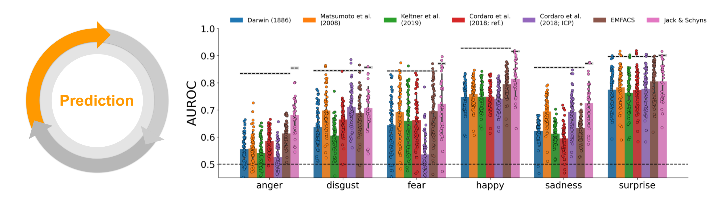
Figure 6.4: Prediction. AUROC scores for each mapping (different bars), shown separately for each emotion (x-axis). Dots indicate individual participants. Dashed line and value directly above represent the noise ceiling (gray area represents ± 1 SD based on bootstrapping the repeated observations). The slightly different noise ceiling for Jack & Schyns results from using half of the participants for evaluation.
6.3.2 Explanation
In the second step of the modelling cycle, we explained the predictions and relative accuracy of the different mappings by quantifying the effect of each AU on model performance using an “ablation analysis”. We systematically manipulated each model by selectively removing (or “ablating”) each AU from each emotion combination and then reran the predictive analysis (see Figure 6.5). The difference in model performance between the original (non-ablated) and ablated models indicates how important the ablated AU is for each categorizing each emotion. Specifically, if ablating an AU decreases performance for a particular emotion, it implies that participants tend to associate this AU with this particular emotion (and vice versa).
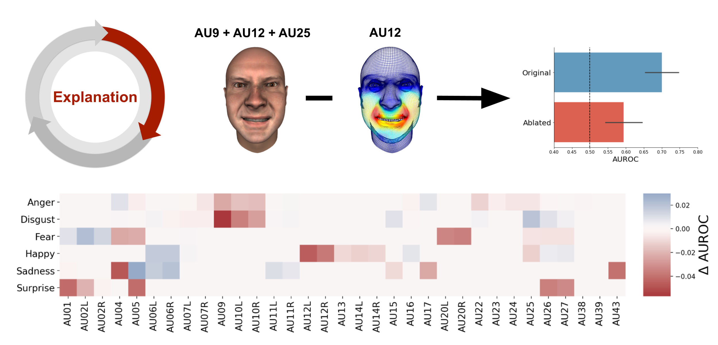
Figure 6.5: Explanation. Schematic visualization of the explanation process through ablation of single AUs. The heatmap shows the average decrease (red) or increase (blue) across mappings after ablation of a single AU (x-axis) from a particular emotion configuration (y-axis).
The heatmap in Figure 6.5 shows how ablation of each AU impacts the model performance for each emotion, averaged across each combination that contains that particular AU (for the results per mapping, see Supplementary Table E.1 and Supplementary Figure E.5). These results reveal both AUs that decrease performance when ablated (e.g., AU9 for disgust and AU5 for surprise) and AUs that increase performance when ablated (e.g., AU5 for sadness). Importantly, these results suggest that models can potentially be improved by selectively adding or removing these informative AUs (e.g., adding AU9 to Darwin’s disgust mapping and removing AU5 from Cordaro et al. - ref).
6.3.3 Exploration
In the third step of the modelling cycle, we used the results from the ablation analysis to explore alternative, optimized mappings between AUs and emotions. We created optimized models by enhancing mappings with all AUs that led to a decrease in model performance after ablation (i.e., all “red” cells in the heatmap from Figure 6.5) and removing AUs from mappings that led to an increase in model performance after ablation (i.e., all “blue” cells in the heatmap from Figure 6.5). Figure 4 (top) shows the difference in model performance between the original and the optimized model. Model performance improved substantially for almost all mappings and emotions, with anger improving the most (median improvement in AUROC: 0.13) and surprise the least (median improvement in AUROC: 0.03). However, all emotions were predicted well below the noise ceiling: the difference between the noise ceiling and optimal model performance ranged from 0.08 for happiness and 0.13 for sadness categorizations (for details, see Supplementary Figure E.6).
In addition, we investigated how the optimized models led to behaviors different from the original models, by computing their corresponding confusion matrix, which shows how a model misclassifies trials. An ideal model will have a confusion matrix with off-diagonal values of zero indicating no confusion. Figure 6.6 shows that the original models frequently confused anger with disgust and disgust with happiness. The optimized models substantially reduced these confusions. To quantify this reduction, we computed percentage difference of misclassified trials (i.e., the off-diagonal values of the confusion matrix) between the optimized and original model, which ranged between 2.2% (Jack & Schyns) and 12.2% (Darwin, 1886).
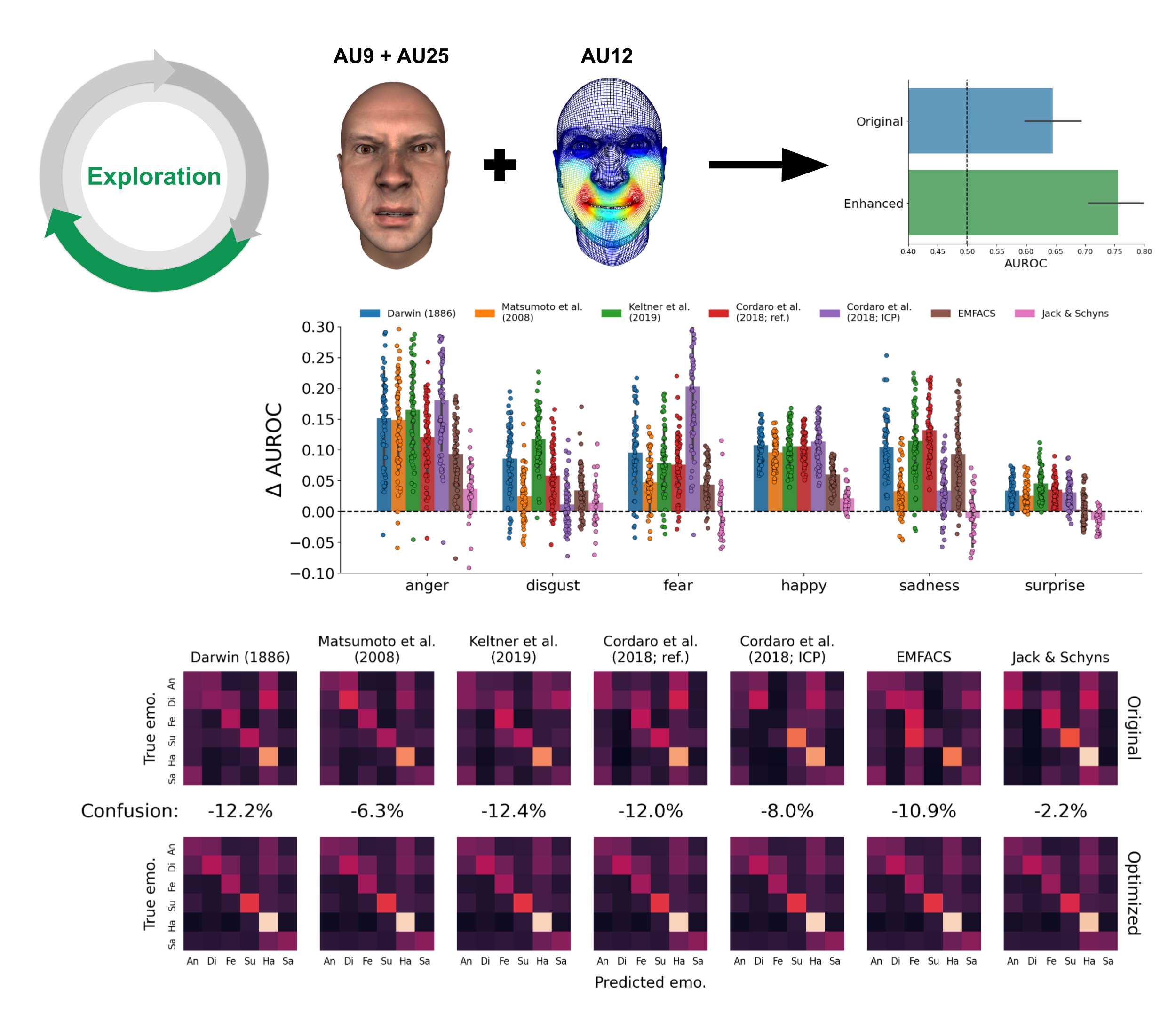
Figure 6.6: Exploration. Schematic visualization of the exploration process through enriching existing models with additional AUs. Bar graph shows the change in model performance of the optimal model relative to the original model (cf. Figure 6.4). The dashed line represents the original noise ceiling. Bottom: confusion matrices (normalized by the sum across rows, indicating sensitivity) of the original and optimized model and reduction in confusion rate.
6.4 Discussion
Since Darwin’s seminal work on the evolutionary origins of emotional expressions, a debate has centered on the question of the specific combinations of facial movements that consistently expressed different emotions. The influential taxonomy of facial movements as AUs proposed by Ekman & Friesen (1976) enabled different hypotheses to be formulated about the specific combinations of action units that underlie the expression and recognition of emotion categories.
In this study, we developed this approach further, by formalizing these proposals for combinations of AUs as predictive models of human categorization behavior. We used these formal models to quantitatively evaluate how well each model predicts the categorization of emotions. We then explained the differences in predictive accuracy with systematic manipulations of the AUs comprising each model. In turn, this generated insights that enabled exploration of alternative and improved models. Moreover, we showed that models were inherently limited in their prediction of human behavior, due to individual differences in how people perceive facial expressions.
With our model-based approach, we could precisely quantify specifically how much different AU-emotion mappings predicted emotion categorizations. We found that all models could predict a substantial proportion of the variance, but with pronounced differences between models. The ablation analysis indicated that these differences could be explained by AUs beneficial for prediction that were lacking in some models, and also that other models comprised AUs that in fact hindered their predictions. We used these insights to explore alternative, “optimized” models that, in turn, substantially improved predictive accuracy. This prediction-explanation-exploration cycle demonstrates that a model-based approach offers a detailed summary of the strengths and limitations of the evaluated models and therefore enables their improvements.
An important advantage of formal models is we can use their predictive accuracy to quantify within a common metric how much of a cognitive capacity is accounted for, and how much is not. To better understand the limits of the evaluated models, we computed their noise ceiling. This partitions the gap between the actual and maximal model performance into the unexplained variance and that due to individual differences (see Figure 6.3). The noise ceiling uses the individual variations in individuals that categorize a given model to estimate an upper bound of the model performance. Variance below the noise ceiling is consistent across individuals and can thus, in principle, be explained by a single, fixed model. In contrast, variance above the noise ceiling represents individual differences (e.g., participant 1 rates stimulus \(X\) as “anger” while participant 2 rates it as “disgust”) which is impossible to explain by a single, fixed model.
Our results indicate that the evaluated models, including in their optimized forms, do not reach the noise ceiling, implying that they likely lack important information. Future research could improve these models so they may reach the noise ceiling. One possibility is to “weigh” the AUs in each model (to weight their importance, or probability), instead of having “binary” AUs (i.e. either “on” or “off”) as is often the norm. Also, facial expressions are inherently dynamic, so incorporating their temporal information could also improve their categorization (Delis et al., 2016; Jack et al., 2014).
The observation that the evaluated models are strongly limited by the observed individual differences in emotion ratings begs the question what underlies these individual differences. In the context of the current study, individual differences could include any factor that differs between individuals, including age, sex, personality and culture of the perceiver &mdash all of which have been shown to influence the association between AUs and emotions (Jack et al., 2012; Parmley & Cunningham, 2014). Incorporating these factors in the models or constructing separate models for different groups (e.g., for different cultures) could account for the individual differences that would otherwise contribute to noise.
In sum, our model-based approach allowed us to systematically test previously hypothesized mappings between AUs and emotion categories, which we found explain a substantial proportion of variance in emotion categorizations, but remain limited by individual differences. These question the possibility of a universal model of emotional facial expressions. We propose that future studies investigate the specific factors that cause individual differences to enable the development of more complete and accurate models of facial expressions of emotion.
Readers familiar with machine learning algorithms may recognize this as a specific implementation of a K-nearest neighbor classification model with K = 1, which is fit on the embedded hypotheses (\(\mathbf{M}\)) and cross-validated on the data (\(\mathbf{S}\)).↩︎